Below is an extract from Jules Verne’s 20,000 Leagues Under the Sea. Using a single typeface of your choice, lay out the text in as inventive a way as possible. Experiment with the letters and words, using the typographic principles you researched in earlier exercises to significantly alter the arrangement of the text, its rhythm and readability.
Think about design group Tomato’s definition of typography – ‘Sound as form’ – and how this concept might apply to your own work. Use the content of the text to inspire visual ideas. How might you experiment with the type to communicate something of the essence of the descriptive content? Think about how the designers you researched in the previous section, e.g. David Carson and El Lissitsky, would approach the text – or artists like Marinetti and Schwitters.
It is important that you play with the text, with individual letters and words. How experimental can you be in making expressive typographic designs? Can you reveal something of the character and nature of the letterform by experimenting with scale and orientation, so a simple unassuming letter becomes a monumental, almost sculptural form?
Think about the sound of the words you are working with, how can your typographic decisions help to communicate these?
As a book designer, you might be more drawn to analog or digital ways of working. Whatever your preference, try to mix and match both approaches. Your work on paper might become a starting point for digital experimentation with this text, or print out your initial ideas, so that you can experiment with what happens when you start to cut, collage or physically alter your text in some way. This physical work can then be scanned to kick start a new digital stage.
Read the text through once before starting to manipulate the type. Make several designed versions of this passage, or parts of it, spanning several pages if need be. Feel free to focus on certain aspects of the text, or use the whole text within your designs. Use your learning log to reflect your creative decision making as well as sharing the various stages of your process.
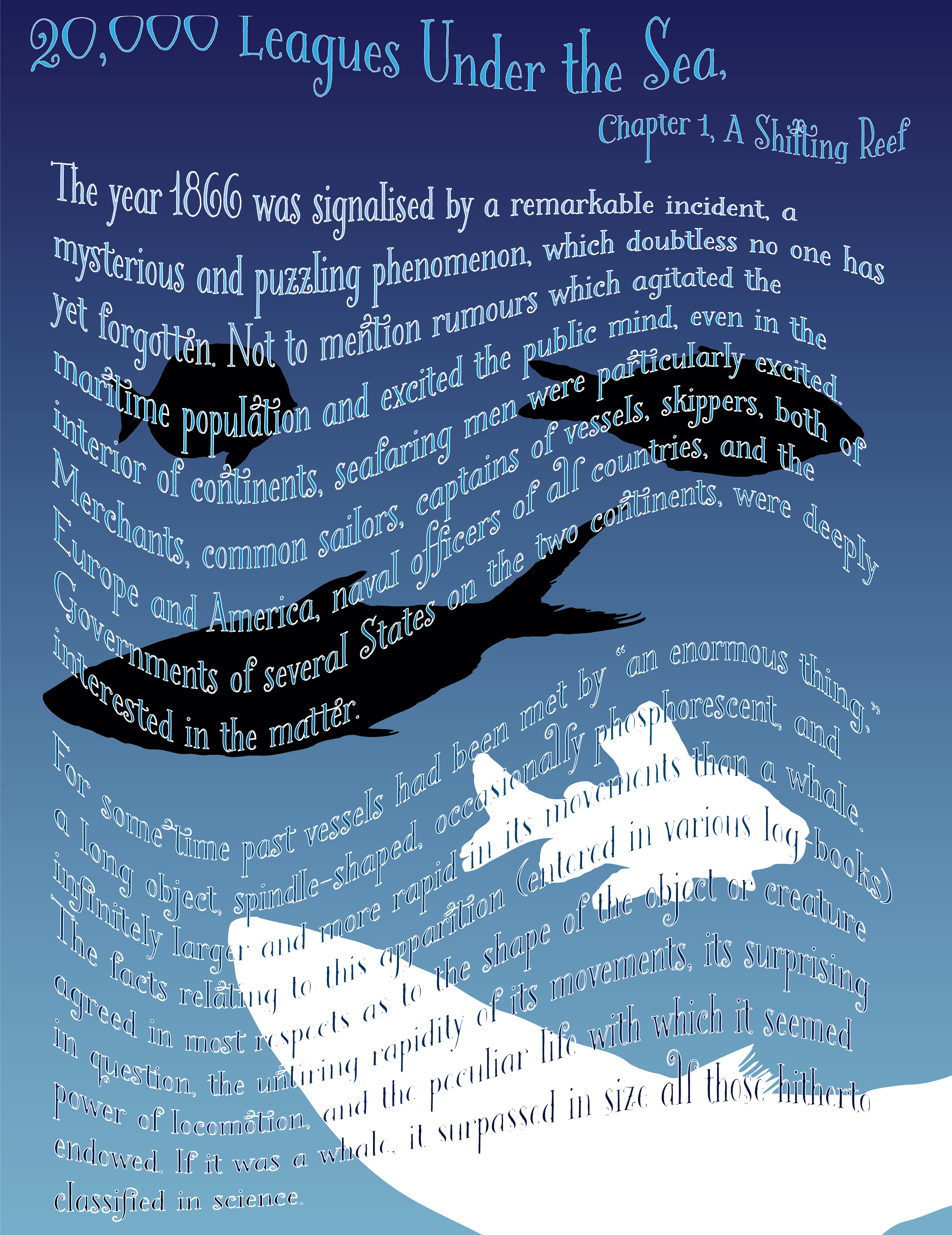
20,000 Leagues Under the Sea, Jules Verne
Chapter 1, A Shifting Reef
The year 1866 was signalised by a remarkable incident, a mysterious and puzzling phenomenon, which doubtless no one has yet forgotten. Not to mention rumours which agitated the maritime population and excited the public mind, even in the interior of continents, seafaring men were particularly excited. Merchants, common sailors, captains of
vessels, skippers, both of Europe and America, naval officers of all countries, and the Governments of several States on the two continents, were deeply interested in the matter.
For some time past vessels had been met by “an enormous thing,” a long object, spindle-shaped, occasionally phosphorescent, and infinitely larger and more rapid in its movements than a whale. The facts relating to this apparition (entered in various log-books) agreed in most respects as to the shape of the object or creature in question, the untiring rapidity of its movements, its surprising power of locomotion, and the peculiar life with which it seemed endowed. If it was a whale, it surpassed in size all those hitherto classified in science.
Choosing a typeface
After reading the selected text I referred back to the section from Derek Birdsall’s Notes on Book Design which was recommended to us, to see if I could extrapolate some preliminary direction to take.
Some of these recommendations were self explanatory such as using a typeface with good numerals for text dealing with lots of data or a typeface with good italics for one that contains a lot of quotes. The selected text I have to work with has neither of these so it won’t be a priority.
I found some other conventions useful to note down as well such as the recommendation of leading being 1¼ to 1½ times the size of the x-height as a minimum. Derek Birdsall recommends paragraph indents being a minimum of the type size. These are conventions that I will certainly bear in mind but I will not be limited to either.
Key words and symbols
I thought the best way to move forward would be to extract the key words from the text, research the key themes and symbols from the novel and also create mind maps around these findings.
Key words
1866, mysterious, puzzling, maritime, enormous (thing), spindle-shaped, phosphorescent, rapid.
Themes and symbols
Submarine (this is the setting of the story), man versus nature is the major theme. Looking at book covers for the story I can see that the giant octopus is a very popular source of imagery.
I drew a mind map to gain some more ideas.

After this I started sketching out some ideas.


The idea to modify some letters such as the double storey g and the letter e into fish seems like a playful idea that will aid the text subtlety.


A script typeface could be used to give the tails and other parts of the letters a look that evokes waves and octopus tentacles.


I also thought there could be more wordplay with extra leading and blur effects for the word ‘rapid’ as well as weighty and wide sizing for the word ‘enormous’.

I researched typefaces that were popular in the 19th century and found that Didone typefaces were commonly used. Didone is a portmanteau of the two most popular typefaces in this group: Didot and Bodoni.

I also pondered how colouring could be incorporated into the text. Phosphorescent colouring and blue gradients seemed like two obvious choices.

As far as layouts are concerned I realised I could shape my typography and place it in different ways to evoke nautical imagery.
These are really only half formed ideas but it has given me some directions to take:
Type choices
didone
octopus swirls
fishy g and e
word play (e.g. rapid, spindle)
Colour choices
blue gradient
Layout choices
shapes
Design 1

For my first design I have used a typeface called ‘Bodoni 72’. I mentioned how Didone typefaces were in use at the time of the novel and this particular choice provided double storey g letterforms for my fish incorporation idea. This design is defined mostly by the arrangement of typography to create fish and octopus shapes. To make the shapes work with the amount of text I had I needed to modify the kerning and justification of each line.
I modified the heading to give it a wave like quality and one word from each of the octopus tentacles with bespoke effects relevant to each word. Aside from this there were only two other instances of typographic manipulation. The increased size of “an enormous thing” and the fish shapes I incorporated into the double storey g and the bowls of the e in the bubbles. Hopefully I have laid out my text in such a way as to make it directional and linear.
Design 2
In my second design I used a typeface called ‘Bookeyed Martin’. This design is defined by the stylish typeface but it is probably the least ambitious of my designs. What drew me to this typeface was the curly quality of the letters found in the tails. I decided to add a wavy effect to reference the sea.
Another defining feature of this design was the use of gradients. Each line of text uses a gradually darker shade of blue to symbolise a descent into the sea. The background gradient was inverted to help create contrast. I also added a white stroke to aid with this.
Design 3
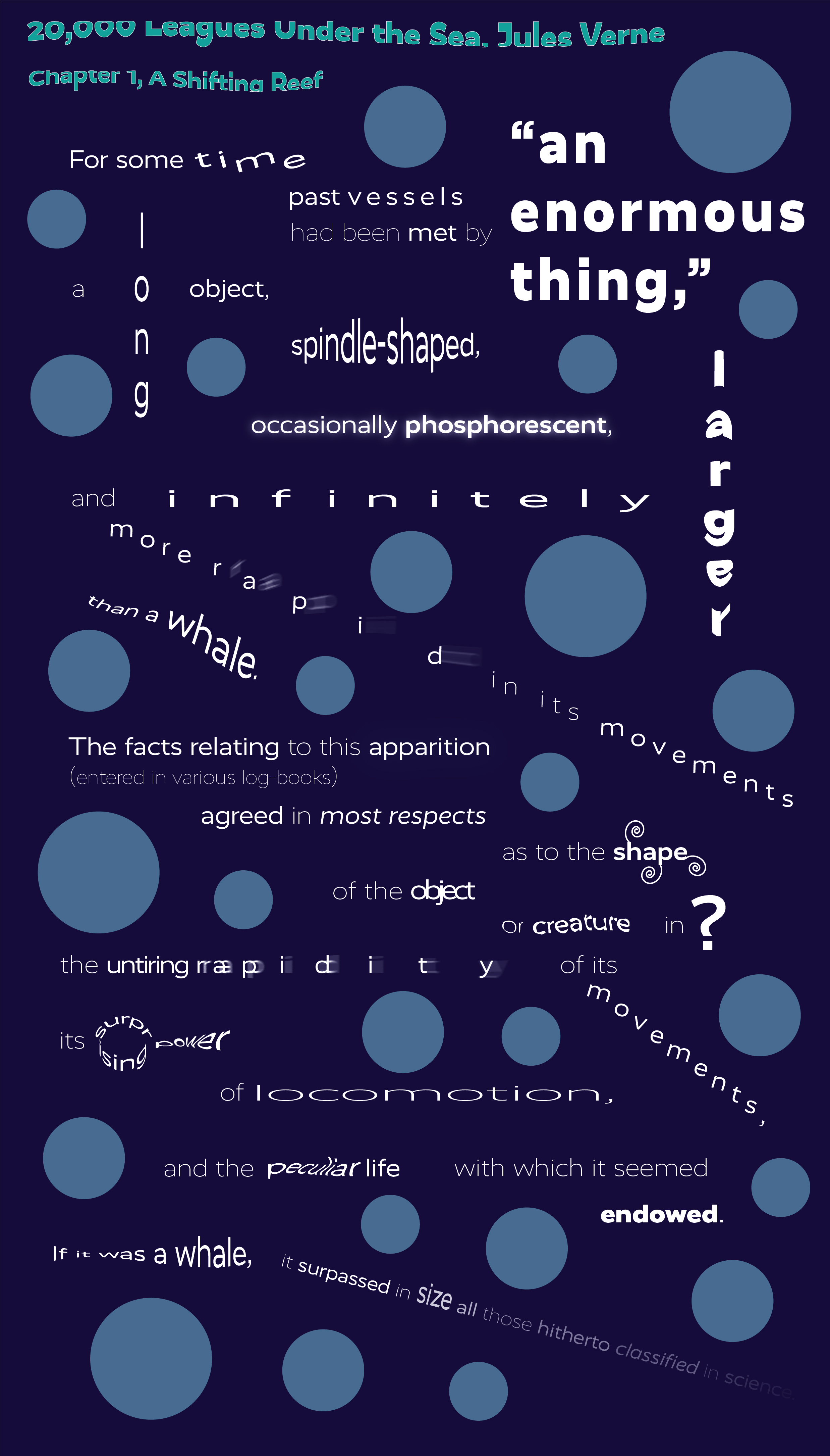
I approached the third design in a different manner. I used an impactful sans serif typeface called ‘RealistWide’. Having a ‘no thrills’ typeface meant that I had to think of lateral solutions to the experimentation. This ended up being my most experimental design. Rather than laying out the text in blocks I approached the text by short groupings of words.
I tried to give this design a musical and rhythmic quality by paying careful attention to font choice (thin, regular, black) and sizing. I used many different effects and typographic alterations to make the most important words come alive.
Reflection
This exercise has forced me to reappraise the role of readability and legibility in typography. There is clearly times when sacrificing this to a degree can boost the impact and meaning of text. There are a multitude of ways that text can be altered to aid in storytelling and I want to use this more as I move forward. My favourite approach was my third design because I believe it has a musical quality to it and transcends the written form it uses. The second design was my least favourite because it was unambitious. My first design sits somewhere between the other two designs in terms of experimentation and communicates through nautical imagery rather well.
References
Birdsall, D., 2004 Notes on Book Design pp. 186-187, New Haven: Yale University Press
the best notes. 2020. 20,000 Leagues Under The Sea: Online Notes / Chapter Summary. [ONLINE] Available at: http://thebestnotes.com/booknotes/20000_leagues_verne/Twenty_Thousand_Leagues_Under_The_Sea_Study_Guide21.html. [Accessed 8 September 2020].
Wikipedia. 2020. Didone (typography). [ONLINE] Available at: https://en.wikipedia.org/wiki/Didone_(typography). [Accessed 8 September 2020].
