Understanding layouts
Research into book layouts that you find interesting. These could be art or design books, or others that have more complex layouts that balance images, typography and other content across multiple columns.
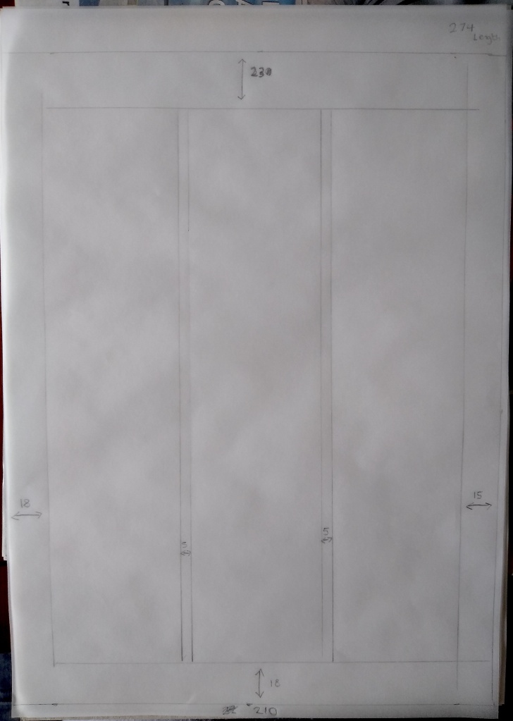
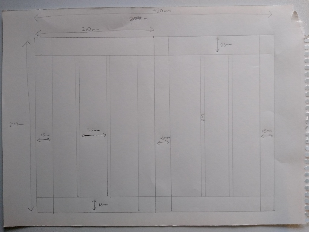
Trace the grid structure of your chosen double-page spread using tracing paper and a sharp pencil. Measure the margins, column width and depth, plus spaces between the columns. Transcribe the tracing onto a clean sheet of paper, drawing on the measurements. Compare your drawings to other double-page spreads within the same publication. Identify the similarities and differences – is there an underlying grid system and how does it adapt to deal with different content?
Now recreate the same double-page spread using DTP software. Use your traced drawing measurements as a guide.
There is no need to copy out all the text – you can use ‘dummy’ text or ‘blurb’ such as lorem ipsum. Lorem ipsum is Latin text which has a distribution of letters that make it look like readable English. You can download some from http://www.lipsum.com and incorporate it into your layout.
Similarly, there is no need to recreate the images – indicate images by a 10% shaded area, whether these are cut-out, full-bleed or within a box.
Try to match the typeface as closely as possible. It doesn’t need to be exactly the same, but try to retain something of the original – for example, make sure you use a sans-serif font if the original is sans-serif.
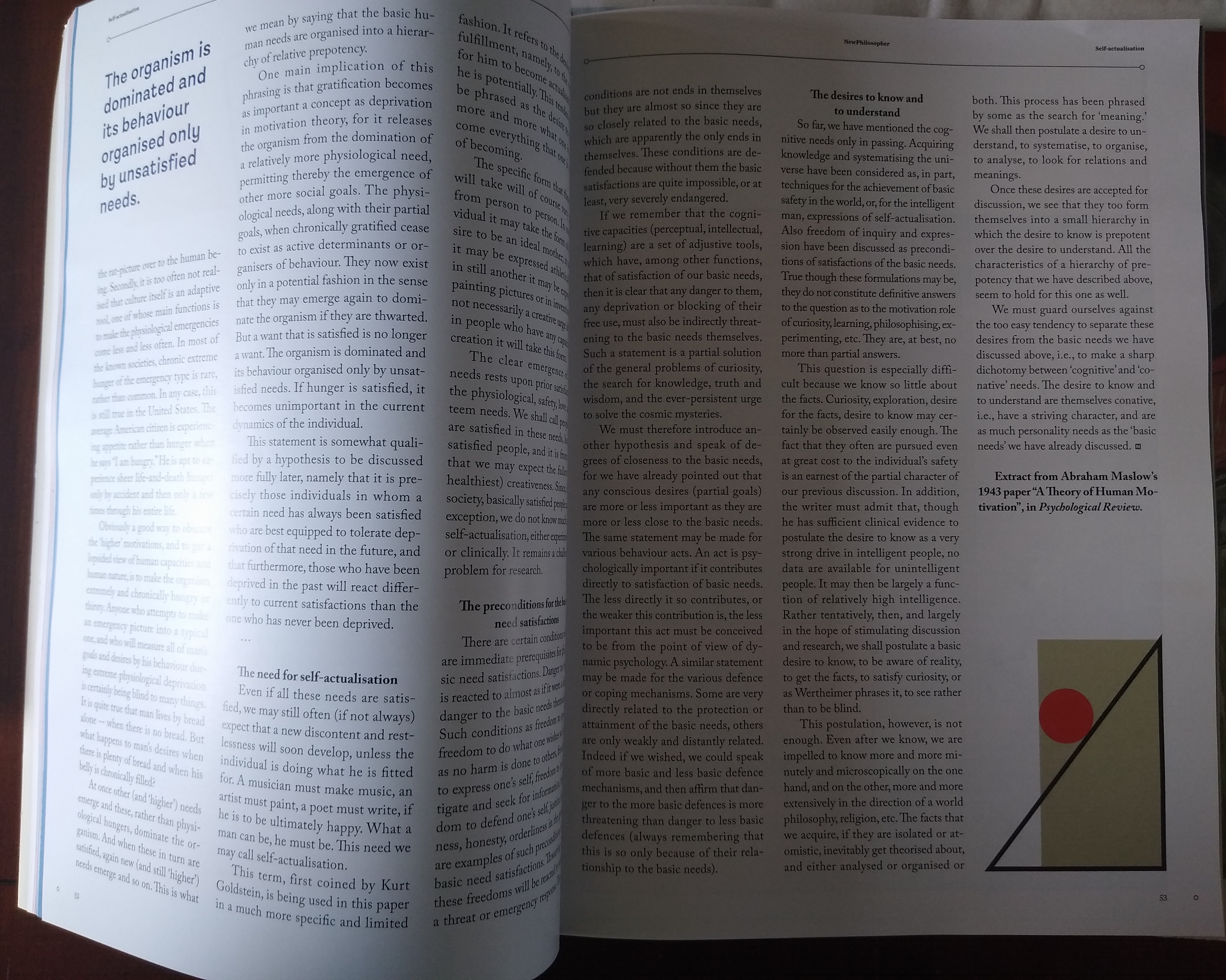
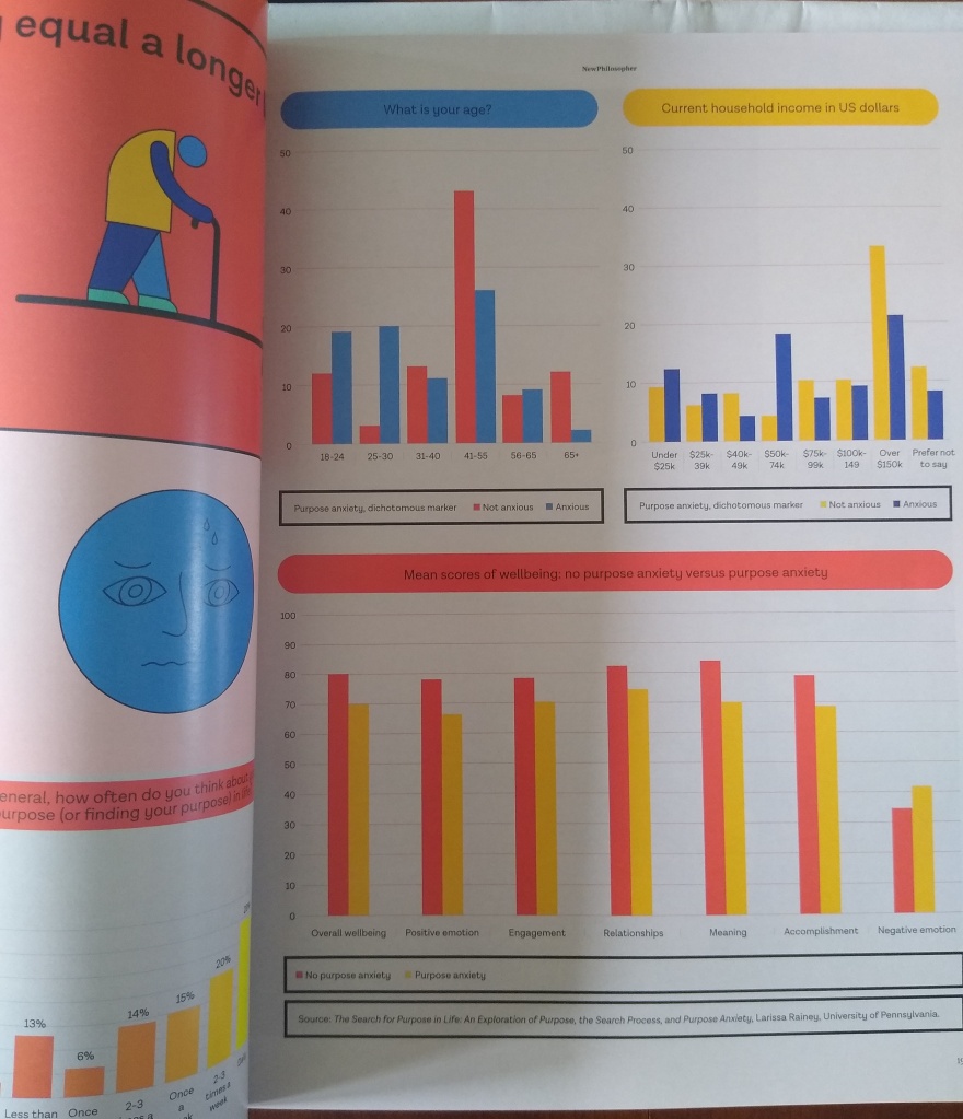
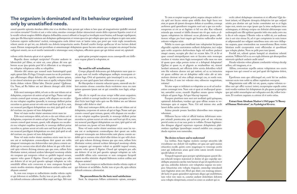
For this exercise I have chosen to look at the New Philosopher magazine and I have identified a double page spread to trace.
I found that both pages have the following measurements:
Double-page spread width 420mm (210mm each page), page height 274mm, top margin 23mm, bottom margin 18mm, outer margin 15mm, inner margin 18mm, column width 55mm, column space 5mm.
When looking at the rest of the publication I discovered that this grid is used for the majority of pages and the margins are used throughout.
There are deviations from this grid when certain spreads use 2 columns or 4 columns as can be seen below.

Infographics and photographs create other deviations from the grid.
Before moving onto the computer to recreate the layout I created a finalised sketch of the measurements on the spread (not to scale).
After I created the document in InDesign my first task was to find the typefaces in use. Luckily, I have Adobe Capture on my phone and with a quick photograph taken I discovered the body text was Adobe Carlson Pro. I figured the size to be 10.5 and the alignment to be justified. However, InDesign created big gaps between words whereas the publication used equal spacing but more hyphenation. With some alterations in the paragraph styles I improved upon this. Some of the subheadings use a bold or italic font and with these subheadings there is also centre justification. The other detail I noticed was that paragraphs had an ident. The top left corner featured a quote in a sans serif typeface. I didn’t match the exact typeface but I got fairly close to it. The illustration was simple so I copied it myself.
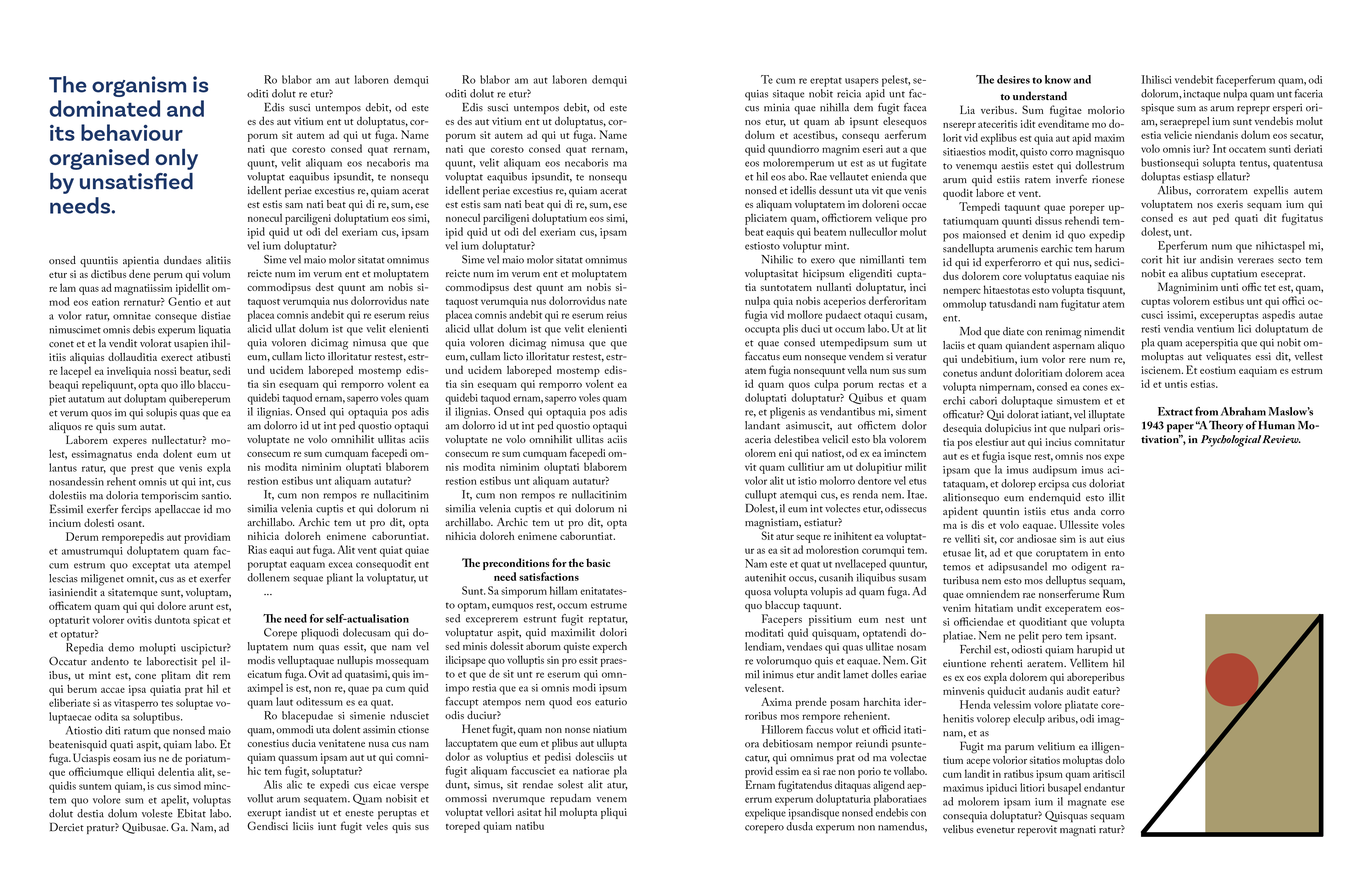
I think my creation was a very accurate representation of the double page spread.
Experimental layouts
Extend the project by thinking about how you might radically change these layouts – what creative decisions around the grid would you make to improve these designs? Develop layout ideas that ignore the grid structure, challenge it, or offer radical alternatives to the existing layouts. Develop a range of ideas through thumbnail drawings and DTP layouts, in a similar way to the first part of the exercise. Use this as an opportunity to take creative risks, and find radically different ways to layout the existing content. This process might challenge any preconceived rules about how a layout should normally work. Reflect on the process in your learning log.
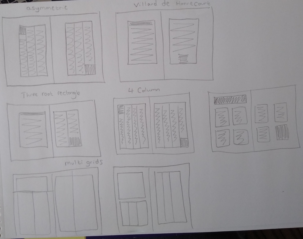
I created some thumbnails with a a range of different layout ideas. I then took three of them and tried them out on my DTP.
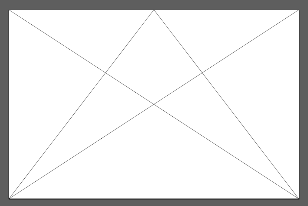
Villard’s diagram is something I experimented with for my Robinson Crusoe book design. I wanted to test it out on this double page spread. Diagonals are drawn in the following way to establish a text area:


On the first page I have used a single column and two columns on the second page. A major problem with this grid is that you lose a lot of space to the margins. This means that you can’t fit all the text into this spread unless you make the text smaller, which would cause issues with readability. To overcome this a change of the magazine format would be needed. The contrast between a single column and double column does give an interesting visual look to the spread.
With this version I used a double column grid predominantly with a single column grid also added to the first page. The contrast is more striking here because of the close proximity of the column disparity. One unforeseen consequence of this change was that I had to enlarge the illustration, and it upset the balance of the spread.
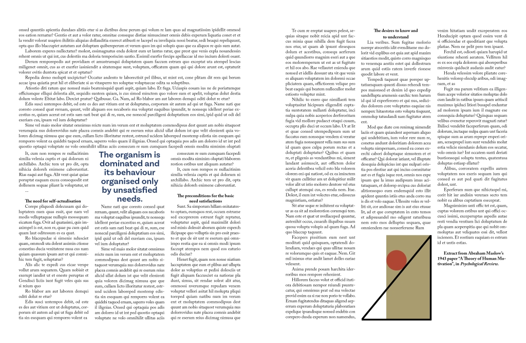
With my final alteration I used a three column grid and a single column for half of the first page. I positioned the quote in the middle of the page. Maybe I should have done a better job of positioning the text on the first page because it looks a bit messy to me.
Reflection
I think the original layout is superior to any of the three alterations I created. In hindsight, I could have altered the dimensions of the magazine to accommodate my grids more appropriately. This exercise has taught me that there are many different things to consider when creating a double page spread and they are all very important and crucial to balancing the composition while also making the page readable. These include but perhaps are not limited to:
- Page dimensions
- Grid considerations such as margins and columns
- Typefaces and size
- Layout/composition
When all of these elements are considered properly it creates a readable and aesthetically pleasing reading experience.
