Your final assignment asks you to draw on all the skills, insight and experience you have gained so far, by designing and producing a book of your choice.
Use the following options to as a starting point or alternatively identify your own project.
Influential book designers
Identify one or more book designers to present through your book. Find ways to develop your own creative responses to their ideas and visual approaches. Delve into their work, find suitable quotations, investigate their influences, and find ways of communicating this material, and your interpretation of it, to an audience through effective use of layout, narrative, and choices of material.
Typography
Extend your exploration of typography by continuing to develop creative approaches to how typography, layout and your material choices can help generate meaning. Develop a book that explores one aspect of typography in more detail, or combines a variety of approaches. Just because your project explores typography it doesn’t mean you can’t also include images, colour and narrative.
Found and altered books
Use an existing book as a creative starting point. This could be an extension of exploring altering books in some way, or as a research project into a specific book that will generate content and creative ideas for a new book. Find a physical book to work with or pick one of your influential books from Part One.
Research the subject in depth and think about the editorial structure (described in Part Three) of your book. What is the flow of the content, would you write articles or create imagery or both? What do you want to tell about the subject and how would you communicate this? And who is your audience? Make a flatplan before you start designing your book, and have a look at other books on the subject to see a different design approach on the subject. You may want to look at the work of designers you inspired by, in order to develop your own design approaches.
You may have identified an alternative area you wish to pursue. This is fine as long as you check this out with your tutor first and document the reason(s) for your choice.
Follow the creative design process in developing your creative thinking and how you will approach the workflow, in terms of content and timescale. Decide on your subject and start researching, creating content, editing content, making decisions about the materials you want to use, and designing your book. Frame this process within an overview of your workflow to help plan the production of your book. Planning the process of generating content, and how this can then be developed, is key to successfully finishing a designed physical book. Keep notes to accompany the process of making of the book in your learning log, and reflect on your design process.
You can use any medium or materials you want to in the production of your book. You may want to research and explore hand-binding, or work digitally with print on demand for production. You may want to combine these approaches and you may want to consider whether you want to produce a one-off copy or a small edition. If you would like to use a particular paper for your book, make print proofs before printing the whole final book. Test the paper, the colours and how your design works on the paper.
Explore the materiality of books in more depth by considering the paper, printing and bookbinding of books, both as content and form. Think about how books are held, interacted with, and the associations of the materials you might use. Explore how these choices can start to create meaning within your book.
Reflection
Give yourself a final self assessment check against your assessment criteria to see how well you think you’ve done. Use this process to help reflect on your work and your achievements on the course as a while. It will also help to identify to you and your tutor any areas you may need to work on prior to submitting for assessment.
Sharing your work
Digital companies such as blurb.com have an online ‘sharing’ facility – this would be a useful way for your tutor to see the whole work without the need for expensive mail costs.
I have chosen to explore typography for this assignment. It is an area I feel that I haven’t explored as much as I would like in this unit. In a previous exercise we had to plan a workflow so I’m going to use that as a guideline for my work on this assignment.
Phase 1: Scoping
This stage will focus on researching printers and finding out information. After printing my own photographs in the previous exercise I would like to use this assignment as an opportunity to create a photo/typography book and combine the two creatively. I would like to use glossy paper to showcase the photographs and also to work with a format that I haven’t used already, i.e. square. Other than this I am not set on anything else at this point.
Saxoprint
Saxoprint offer small print runs for hardback books. There is an option for one square size which is 210 x 210mm which I will base following comparisons on. The minimum amount of pages a book can have is 48, so I will also base further comparisons on this number. The relatively high minimum page number will influence my decision on whether to use this printer because I may not need to use 48 pages. There is the option to use either 1-1 coloured (black) or 4-4 colour euroscale (this is also known as CMYK) – I will of course need to use the colour option for my photographs. I have chosen 17ogsm gloss for the paper although there are uncoated and silk options which range from 100gsm to 170gsm. The cover is 135gsm silk with 2mm cardboard and there is no other option, this could potentially be a drawback. The binding is perfect and again there is no alternative and the endpaper is 250gsm silk with a gloss finish cover.
For these options delivery is approximately 8 days and the price of one book is £36.88
Saxoprint offer free templates and an artwork check service. They also have an exhaustive checklist for preparing files for print: https://www.saxoprint.co.uk/checklist-print-file. To make things even simpler they feature an add on for InDesign called Saxoprint Pro Design which helps with the design and file creation.
Pros
* Affordable
* Templates, artwork check and print checklist
* InDesign add on
Cons
* High number of pages needed
* Limited cover options
Mixam
Mixam offer quite a range of options for books on small runs but I am particularly interested in the ‘art book’ option which would be tailored towards a book such as a photo book. There are three main options to begin with: hardcover, paperback and layflat. Layflat books feature a single sheet folded for each page which are then glued to the next spread, this makes it the perfect choice for showcasing art and I will get a quote based upon this option. As with the previous printer I’ve opted for 210 x 210 mm, 4 colour printing and 170gsm gloss – 130, 150 and 200gsm gloss is also available. I have opted for 48 pages again but you can go as low as 24 which could be more suited to my assignment. I have chosen a 200gsm silk cover with a gloss finish although there are options ranging from 170 t0 400gsm.
Delivery is approximately 9 days and 5 copies (the minumum) costs £40
Like Saxoprint, Mixam has an extensive checklist for preparing print ready files but they do not have any templates or programs. https://mixam.co.uk/support/checklist
Pros
* Art book and layflat options seems great
* Decent range of paper weights
* Very affordable
* Provides print checklist
Cons
* No templates or downloadable add ons/programs
* Longer delivery
Helloprint
Using a 210 x 210mm size I have chosen 170gsm gloss paper, although smaller weights are available. The cover options are either 300gsm matt or 300gsm gloss. I have chosen matt but this does feel a bit limited. I have chosen 48 pages but you can go as low as 28 pages.
Free delivery is 7 days although you can pay extra for 5 or 3 days and 1 copy costs £42.49
Although Helloprint do artwork checks and provide file specifications they don’t offer a downloadable program. https://hello-submissions.herokuapp.com/en/submissions
Pros
* Provide artwork checks and specifications
* Relatively affordable
Cons
* Limited cover choices
* No add ons/downloadable programs
Blurb
Blurb offer a 30 x 30cm book which is a little bit bigger than the other square formats I’ve seen so far. The following price is based on 1 copy of 48 pages. Premium lustre gloss or matt 148gsm with imagewrap hardcover costs £52.75. There are more elite papers but this pushes the price point way past where I would want to go. There is also an extra 25% charge to pay if you want to remove the blurb logo from the last page.
There is a blurb plugin for Adobe InDesign which lets you layout designs directly in InDesign. They also offer a free desktop program called BookWright for book designing. I downloaded the BookWright program and it offers designs for flatplans which looks really promising.
Pros
* A bigger square format is available
* Elite papers
* Quality plug in and program available
Cons
* Expensive
Phase 2: Creating content
This phase entails research as well as the creation of photographs and typography, although this might overlap with the next phase as well.
I decided that a logical starting point before doing anything else would be to think about what kind of collections I could sort my photographs into. I have already decided that I’m not creating new photography for this assignment so the question is which set of photographs should I use for this book? I have included an example of photographs for each collection I think I could use.
Landscapes and nature (sepia)


This series is all presented in sepia tones and features local places and natural scenery. The series evokes feelings on place, time, history and rural landscapes. The photographs are presented in a moody, atmospheric way.
Photo count: 40+
Experimental (sepia)


This series is predominantly created in sepia tones although there is sparing use of colour. The shots feature places both natural and manmade and focus on uneasy feelings. This could possibly be combined with the other sepia series.
Photo count: 10+
Abstract psychedelia (colour)


This series is more or less about defamiliarising nature with a strong psychedelic sensibility. This could potentially be combined with the previous set.
Photo count: 10+
Playful nature (colour)


This series is linked by a focus on nature and use of colour. It is playful in nature and experimental in subtle ways. It examines place and defamiliarises but not to the extent of the more abstract shots.
Photo count: 10+
Traditional landscapes (colour)


This series looks at mostly rural landscapes and is the most traditional. This could potentially be combined with the previous set.
Photo count: 20+
The amount of photographs won’t necessarily denote the amount of pages I need because some pages may feature multiple photographs whereas other pages might not have any. There is also an alternative to focusing on one of these sets – I could devote a section to each collection and evolve the typography around it.
Research
One of the photo books in my collection is Our Forbidden Land by Fay Godwin.


From a layout point of view there are varying choices for the photograph placement throughout the book which keeps each spread looking fresh and interesting within a grid system. As you would suspect, the typographic choice is a traditional looking serif typeface which complements the rustic character of the imagery. This is not a book that focuses on typography so although it can give a taste of image placement it doesn’t tell me very much about typography.
I stumbled upon an experimental typography book by a designer called Adam Rogers.

The above image is an example of a spread within his book. He has transformed type into dominating illustration and it reminds me of a photography monograph. I like the way he has used various sizes, layouts, weights, spacing and fonts to achieve a really dynamic look and it’s not difficult to image how photographs could be combined with this to create an interesting interplay. This has led me to the conclusion that I should focus my assignment on experimental typography and photo incorporation into that. With this in mind I should research this specific area further. I’ve also had a look at how other designers have combined type with photographs. I found Bureau Borsche’s work for Nike to be quite relevant in this regard.


The designs are strong. The colour pops out, the typography is bold and there is a dynamic interplay between image and word. The subtle yet powerful use of typography I especially like in the decreased kerning of ‘BRING YOUR GAME’, this gives it a mantra like quality. You often see typography and imagery bleeding into each other with overlays and cutting but Borche avoids that completely here and doesn’t allow any type to creep into the image box. He himself says “The athletes are the focus, the design should never conflict with the content.” so this tells us why he has made that choice. I think it works very well.
Vaughan Oliver was a renowned album cover designer and as somebody who owns many of the albums he worked on I’ve always been drawn to the way his typography would complement imagery and somehow evoke the sound of the band. In an interview with Printmag there is a quote that really stands out for me. When told that his designs are as mysterious to the interviewer as the lyrics on that particular album he answers:
“That’s why I like working in the medium of music sleeves. I enjoy working there as well because of the collaboration with the music. Kind of working in tandem with it. The goal what we’re (graphic designers) aiming for is to reflect the music; the sleeve should be a gateway into what the music is about without defining it but also providing a suggestive mood and atmosphere. A sleeve for Lush, or Pixies, isn’t interchangeable for a sleeve for the Cocteau Twins. The music has led each design. I always start with the music, read the lyrics. Because I think it’s such an otherwise simple or superficial exercise—take a fabulous image, and a bit of wonderful cutting-edge type and, oh, wonderful sleeve. But if it doesn’t connect with the music, it’s worthless. I think the strongest sleeves are the sum of the parts.”
Vaughan Oliver
This is quite inspiring to me at the moment because I want the typography in my book to achieve a similar goal, only reflecting photography instead of music. By starting with the photography I can then respond to it with typography. A few examples of his work I have included here.

Scott Walker’s music on The Drift is very avant garde but Oliver shows restraint and resists going the same way with the type – the abstract textural imagery does that well enough. Instead the type is serif with a touch of sophistication and reflects the serious nature of the work.

The typeface for the band name reflects the free flowing visuals and evokes the ethereal quality of the music.

I’m not familiar with this album but I think that the typeface choice for ‘Breeders’ is a wonderful reflection of the image with a curvy, spiral-like quality.
I have also spent some time looking at editorial work which often features very creative layouts and smart relationships between type and image. These design choices are similar to the Fay Godwin book in how there are various dynamics and layout choices within a grid system, however a lot of these designs are more ambitious and experimental. This is just a small selection that I saw on Pinterest but you can spend days trawling through other design work of an equally high level.
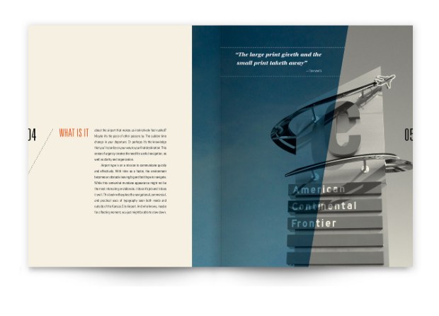
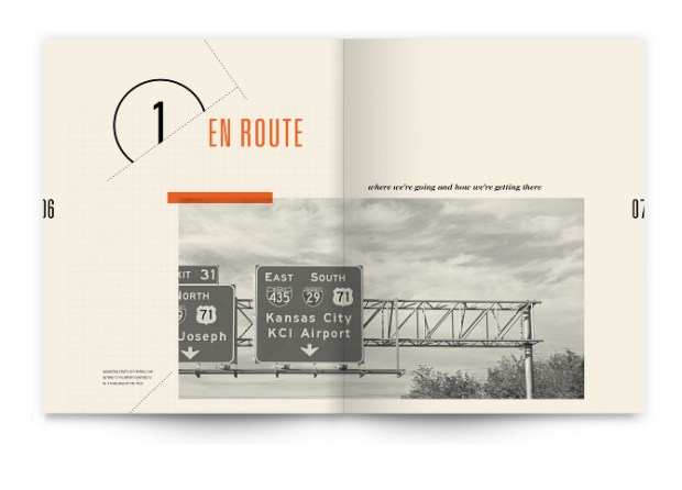
These spreads from Lifted: A Look at Airport Typography by Sally Carmichael show some fascinating examples of layout. I really love how she was unafraid to place the image over the folds and to vary the placements of text and image. You get a feel for the minimalism in airports and the functionality needed.


Variety is also a key ingredient in a project called āpice – The 1975 I found by an artist named Micaela Castellaro on Behance. She embraces minimalism, various reading orientations and differing sizing and placements.

Not all spreads are limited to a few images. This design by Edwin Van Gelder features a multitude of photographs on a spread. The intelligent layout helps to avoid a cluttered, ugly look on the page.
I also explored the depths of Pinterest for ‘experimental’ typography examples. It is an area you can spend days on and quite happily tumble down the rabbit hole, however, time is against me and I am only providing a few strong examples that stood out.


Fatih Hardal has a lot of wonderful work in the medium of posters. A common technique he uses is using broken or deconstructed type, by obscuring the words it forces the viewer to take a closer look and focus more on the words paradoxically. I also like the use of towering type that dominates an entire poster, it’s very in your face. Textures and colours are also common in his work.


Roman Post is another designer who likes to work with the medium of posters to experiment with typography. On first glance Post’s work looks more precise and meticulous. I like the extreme alteration of letter height and the various letter sizes used alongside each other which creates striking contrasts and visual hierarchies.

This image above is from an unknown artist but I think it’s an interesting example of a more organic kind of type alteration. I say organic because it looks like a physical word has been thrown into acidic water, in reality it was probably achieved on a program like Photoshop. It does open up new possibilities in type experimentation.
This research has led me to some unusual places such as advertising, editorials, posters and album covers but I have found it all quite relevant to the book I need to create. Adam Rogers work proves that typography can stand alone in a book as both text and image and be very visually appealing. Vaughan Oliver’s album cover design is an example of meticulously designed type that responds to other media to create expressive works. The editorial works showcase the importance of grids and the relationship between text and image on spreads when designed smartly. The typography posters are powerful works of art that use various techniques to create an impactful visual.
Mind maps

I created a mind map which didn’t conjure up many ideas. I think this may be due to the nature of the direction I want to take. I want to respond to the images with typography in a process akin to designer Vaughan Oliver’s. I expect to me more productive when I begin sketching ideas out. A few ideas have surfaced though such as:
- Just using black/sepia type for the more traditional collections and opening up more colours for the experimental collections.
- Type reflecting the nature of each image.
- Type becoming more abstract/experimental as the book progresses.
- Not using a grid for the abstract series.
- Different colours/typeface for each section.
- Using a lay flat book.
It remains to be seen how many of these ideas are good or bad or worth pursuing.
Collections
I have now gone through my photographs and selected the images I want to include in my book and organised them into four collections.
Nature and landscapes in sepia


Nature and landscapes in colour


Playful nature in colour (a transition to the abstract section)


Abstract/experimental in colour and sepia


Thumbnails
I created some thumbnails to highlight the standout shapes and I made notes of other features that could translate into type attributes. This was also a good way of identifying the links between photographs which could influence how they are placed in the book, e.g. sepia photos of paths, colour photos featuring yellow and blue. I then created thumbnails to try out various image and text layouts. I wasn’t using precise grid specifications but working with modernist principles (or lack of) in mind. There are many variations that can be played with here, from photographs taking up an entire spread to 4 or 5 photographs on one page. I also like the idea of photographs overlapping the fold which is influenced by the findings of the research I carried out.


I then created a flat plan that splits the main 4 categories into subcategories. I did this in a way that would allow full spread images and multiple images on page. Including the covers this totals 40 pages which I’m happy with.

Phase 3: Design
In this phase I will develop the type digitally and work on the page layout and arrangement of text and images.
As I moved onto software I decided to use Blurb’s InDesign plugin which provides easy to use templates. I had initially wanted to try the larger square format for the book but the price was too high for me so I opted for the smaller 7×7 inch format that Blurb offers. I knew the page count that I needed and the other options could be changed later if needed.
I created a grid for my book. I used a modernist grid and each page is divided into 6×6 squares.

To begin with I created a layout of my photographs. Inspired particularly by the editorial layouts I had researched I arranged the photographs in a variety of ways – small, large and sometimes overlapping pages. In the first section I wanted a serif typeface that could look traditional and complement the nature-based sepia photography, but I also wanted it to be a little bit unusual and striking. I tried out a few typefaces in both upper and lower case using the photograph’s title.


Swear display has a few attributes that I like. It has incredibly strong contrast and very angular serifs which creates sharp, impactful text.


The cilati variation feels more ‘free flowing’ and has a curly playful quality. I don’t think it’s solemn enough for my intended use.


Bely bold has less contrast and blocky serifs. Swear display bold was definitely the best fit for the first section of my book so I decided to use it.

I began trying out different typographic arrangements within the grid system. As you can see in the image above I wasn’t afraid to break words up and use other techniques such as vertical text. The image below shows more experimentation.

I was also quite meticulous in certain aspects. One example in the image below shows how I decreased the height of certain letters to make sure they fit neatly into the grid system.


I reevaluated the work so far and decided that the spreads looked too cluttered. I opted for a less is more approach and removed all text except image titles. The image below shows how much cleaner the design looks with less typography and more white space.

The next section showcased colour photographs. I wanted a simple, functional, modern sans serif typeface for this section and I chose one called Avenir next and used the bold font which I felt was perfect.

I needed to embrace colour here in the typography so I began by mimicking the dominant colour in each photograph. I felt like I was on the right track but it lacked a bit of punch. I tried creating a clipping mask with the text over the photograph and this created visually interesting results.


With some of my designs I used lines to try and balance the image although it didn’t always have the desired effect. To overcome this I removed the lines, repositioned the text and sometimes increased the image size.


The next section needed to up the experimental level a little bit so I used a typeface called Minerva modern. This sans serif typeface has slightly more unusual attributes to the previous sans serif choice such as more contrast and disconnected elements.

I will talk about the typographic alterations in more detail later but one example can be seen in the image below of the word Blackthorn. I was very inspired by the typographic posters here and altered the type height and width to create a joined up shape with vertical alignment.


The last section featured the most abstract photographs so I needed a more experimental typeface where legibility and readability could be sacrificed to aid overall visual style.

I used a typeface called Marshmallow which is thick and very ‘shapey’. I will talk more about specific typographic alterations in a bit. I chose to leave this text black so the book could come back full circle to the beginning.

The link above shows the final version of the book pages. Many of my brainstorming ideas were kept throughout the process; this includes the use of black text for the traditional photographs, typography reflecting the images (more so in later sections) and the typography becoming gradually more experimental. I didn’t ignore the grid for the abstract section or use different colours for each section, which I think was the right choice. Below I will briefly talk about the typographic and design choices of each spread.

The first section is the least experimental, however, that doesn’t mean I haven’t made a few unusual choices to increase the visual interest of the design. This first page a features the type broken up on either side of the image. I also added a line after the text to balance the design.

I added an effect to Cloud Sailing so it would have a more cloud-like quality. I also angled the text to follow the slope of the image – an example of the text and image communicating. One of the images overlaps the fold of the spread and this is the only spread that uses lines, which is in response to the Telegraph Lines image. This text also features extreme alterations to the letter height to give a line-like quality.

This spread is the first that is ‘on its side’. I found that this broke things up enough to keep the book interesting. I purposely kept lots of space around The Solipsist and kept it minimal. I hope my choice for Echoes is self-explanatory. Niflheim is the world of fog in Norse mythology so I used an inner glow to achieve this kind of effect.

Sometimes I chose to let an image fill a page which you would find quite often in a photobook. As can be seen in this spread and many others is my choice to break words up – this is to maximise the use of space within the grid system. I also increased letter spacing when needed to help with this. I added an effect to Leaf and Light to give a leaf-like quality.

In the word Immemorial I have increased the width of certain letters to mimic the rock in the image. I have also altered the o’s on the other page to look like mushrooms.

The first spread in the colour photograph section. I allowed the visual element to take up most of the spread and as I mentioned the type has a clipping mask to reflect the image.

There was some gentle experimentation with this spread by increasing letter width and positioning.

This is another spread that has been turned on its side. The entire design has been kept quite minimal to reflect the words and image qualities.

Again, the experimentation is subtle with alterations to size, kerning, heading, leading and placement. This entire section features slight experimentation, even less than the first section but it is unified by colour and photograph type textures. This is about to change in the next section.

This section features more typographic alterations than the first two sections. I have allowed the photograph to take up most of this spread. I already described the Blackthorn text but you can see here that I made the text ‘thorny’ as well.

I gave Whispers and Otherworld aural qualities. The word whispers gradually disappears and the word otherworld has a vague, hazy quality which I emphasised by increasing the letter spacing. There are two unique techniques I used on this spread. I appended two of the images with a slice of the opposite side of the image, this creates a strange looping effect visually. I also added colour to some of the text to mirror colour in the photograph. This gives this spread a strange quality breaks up the flow of the section.

This is another sideway spread. Upon this Earth bulges out like a sphere and Fairy Stool is reflected in a dream like way.

The last spread of the section continues the technique of text reflection. This ends a section of playful but refined alterations.

This is now the abstract section and I wanted the type to reflect this with more experimentation and visual style at the expense of legibility and readability. The image for Splitting Infinity sits in between text that has been split up. I condensed the text and curved the shape so it could visually mirror the image.

Qualia has been distorted almost beyond recognition. The word describes individual instances of subjective, conscious experience so I though a unique distortion was apt. I couldn’t resist making Spinose spiky and giving Night Drive a motion blur effect.

This spread features distortion and type alterations that I hope emphasise the aesthetic of psychedelia.

The rest of the section features sepia based experimental shots which I think brings the book around full circle. I also opted to leave the type black for this same reason.

With the title Passage I arranged the letters in an unusual way, I then copied and distorted the letters to various degrees and changed the sizing and placed them in an almost random way. The text becomes incomprehensible but it picks up a very illustrative quality which I like.

The last double spread features more minor alterations. The O’s in Horizon are a not-so-subtle reference to the image.

The last page plays with sense of depth by altering size and text shape.
Once I had finished with the book pages I had to create a cover. With four distinct sections I toyed with the idea of incorporating the different typographic styles and images into one cover but my desire for a simple and impactful cover overrode this. I chose one of the more minimal images from my book and used the Avenir next typeface because of its bold simplicity. I chose to call the book Symbiotic because of its focus on the interaction between text and image.

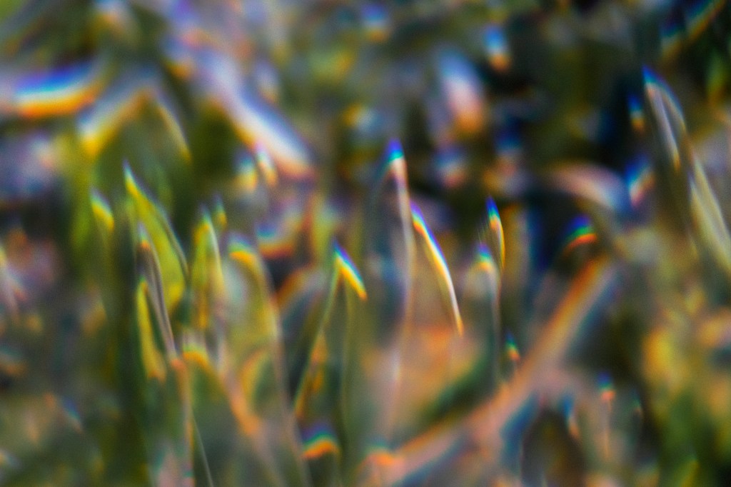
I tried the text in black but felt that something was missing, I then tried the clipping mask technique to tranplant grass into the sky and sky into the grass. I thought this was a good way to create a visual metaphor for the title and overall theme in the book.

At this point I will submit the files to my tutor but I want to print the book as well at a later date. I have used Blurb for this process and it has influenced my decisions because of prices. I will use the small square format of 7×7 rather than the large square format of 12×12. I will use their proPhoto pearl paper which should be a great paper for the images. I will also use a hardcover. This will bring the cost of 1 book to £36.78.
Assignment and course reflection
I have thoroughly enjoyed this assignment, perhaps on par with the zine assignment and the Robinson Crusoe book cover assignment. Having a chance to experiment with typography and think about the relationship between text and image has been an engaging challenge and has left me feeling a lot more confident with my typographic skills and my ability to create meaning, while still taking risks. I think looking in different areas for inspiration and research other than books has served me well as well. I found Vaughan Oliver’s work to be a great source of inspiration in terms of approach and the editorial designs influenced my design and layout choices. The typographic posters pushed me to take more risks with the typography also. At the end of the assignment it’s very fulfilling to look at a book design you have created all by yourself and I look forward to printing and using that for my assessment.
There are four areas of assessment criteria which I will now look at:
Creativity
I think I have done fairly well with this criteria during the course. In this assignment I have approached quite a diverse range of images and found ways to explore them with typography, both traditionally and unconventionally. Even with my least successful assignment (altered book) I developed some very creative ways to illustrate the seven deadly sins.
Research and idea development
This assignment is a good example of my ability to assimilate a variety of ideas and research findings into my own work. Throughout the course I have generally done good amounts of research although there could be room for more tests and trialling of different ideas I think
Visual and technical skills
This criteria I see as a tale of two halves. On one side I can employ strong visual skills in photography, typography and minimalist illustration on digital platforms. This can be seen in assignment 1 when I created a digital zine that still had a lo-fi aesthetic, the Robinson Crusoe where I created striking illustration and the latest assignment with typographic and visual interplay. Where I fall down is my ‘hands on’ technical skills which can be seen in the altered book assignment. Although I had creative ideas for that assignment my execution let me down and this is a weakness of mine.
Context
I really enjoy exploring the contextual world in my work. My zine incorporated lo-fi/indie aesthetics and I really enjoyed creating a cover for Robinson Crusoe where I looked at historical associations and combines symbols to create new meanings, i.e. footprint and island.
S0 overall, I think I do well with creativity and context. Technical skills are better digitally than hands on. Research is good but there’s always room for improvement.
References
Godwin, F., 1990. Our Forbidden Land. 1st ed. London: Jonathan Cape Ltd.
Behance. 2013. Experimental Typography Book. [ONLINE] Available at: https://www.behance.net/gallery/10178309/Experimental-Typography-Book. [Accessed 1 April 2021].
Print. 2010. An Edited Interview: Vaughan Oliver, Album Designer. [ONLINE] Available at: https://www.printmag.com/post/interview-vaughan-oliver. [Accessed 1 April 2021].
Bureau Borsche. 2021. Bureau Borsche. [ONLINE] Available at: https://bureauborsche.com. [Accessed 1 April 2021].
It’s Nice That. 2016. Bureau Mirko Borsche works with Nike Basketball on a new graphic language. [ONLINE] Available at: https://www.itsnicethat.com/articles/bureau-mirko-borsche-nike-basketball-020216. [Accessed 1 April 2021].
Hardal. 2021. Hardal. [ONLINE] Available at: https://hardalstudio.com. [Accessed 1 April 2021].
Behance. 2021. Roman Post. [ONLINE] Available at: https://www.behance.net/supremat. [Accessed 1 April 2021].
