In this exercise you can use any images created elsewhere in the course, to print onto the paper samples you collected earlier.
You are encouraged to be experimental in these exercises; it doesn’t matter if you make a mess or get things wrong in the images you make. It is important to reinforce this message at this point in the creative process, as often people tighten up when they think they are embarking on the final piece, and lose some of the fluidity and spontaneity of their original ideas. We want to keep the visual outcome of this exercise fresh and not stultified by perceived conventions of what is ‘right’.
When you’re exploring visual ideas and processes, the outcomes may not always be what you thought they would be at the outset. You won’t always get it right the first time, and this is how it should be. By repeatedly trying out and experimenting with the materials and ideas at hand, you’ll discover new ways of working. Occasionally ‘mistakes’ turn into happy accidents and prompt a way of working, or technique, that you might choose to deliberately recreate and integrate into your next project. For example, one colour may bleed into another, or your coffee cup might leave a stain on your working paper. Instead of throwing these elements away, you could integrate them into your design process.
When you’ve created a set of images, scan or photograph these to create digital files – JPEGS or TIFFs on your computer. Make sure the resolution is set at 300dpi. Having gathered all the images together in one folder, consider how you’re going to print them. What order will the images appear in? At what size? How will the image appear on the page? Which paper will you use for which image? Do you have a particular image in mind for a particular piece of paper? Will you try printing the same image on different sheets of paper?
Draw a simple flatplan as a guide to working out how and where the image will be placed on the page, whether you will include any text, and to explore how the idea of ‘narrative’ might work. You might set up your page layout in DTP software, and work with your images digitally in this way, or you may simply print direct from your photo editing software onto the paper samples.
You may choose to use a desktop printer to output your images, or you may research other print methods such as screen-printing or etching. Print at least 16 pages using the images you’ve created on the paper samples you have collected.
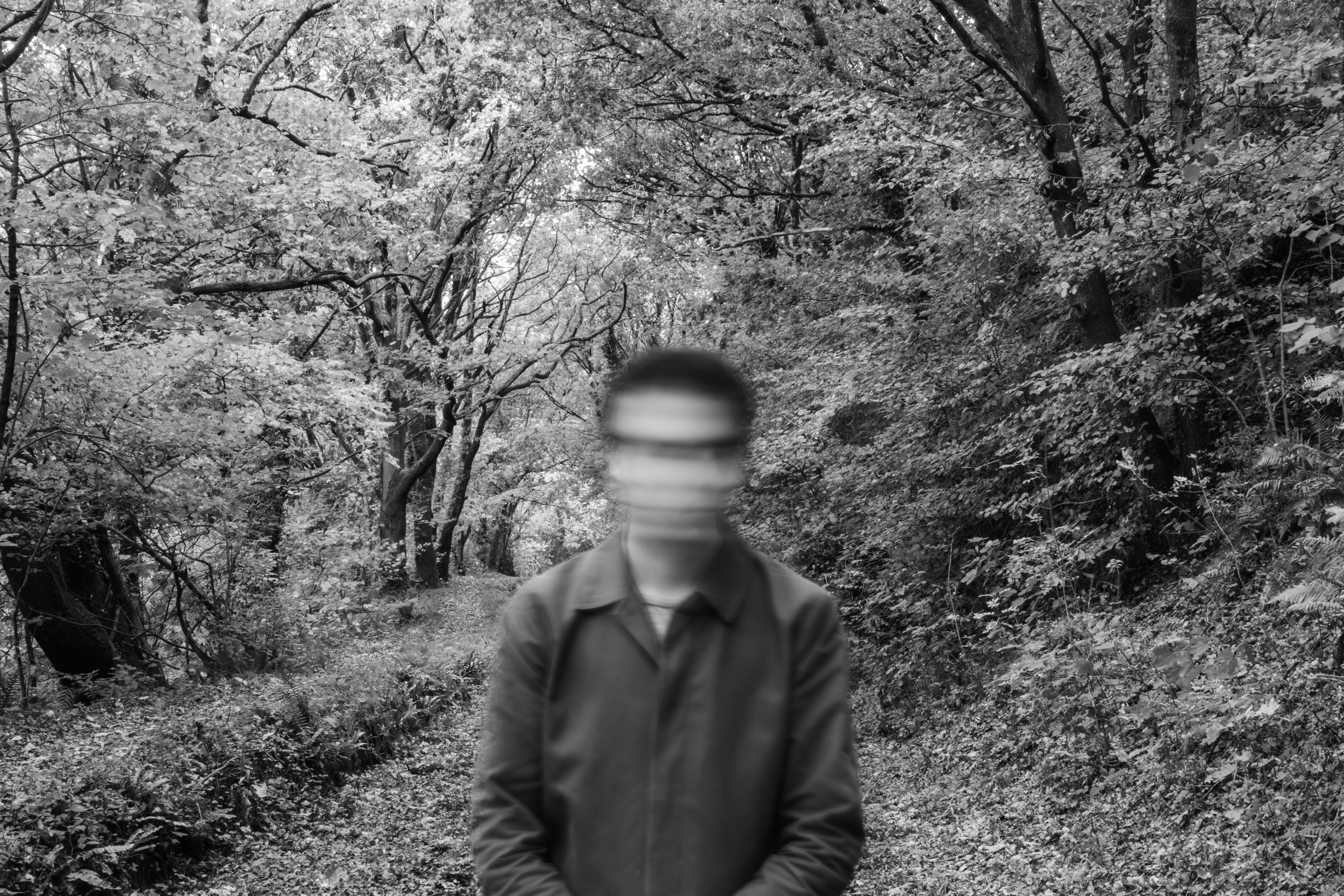
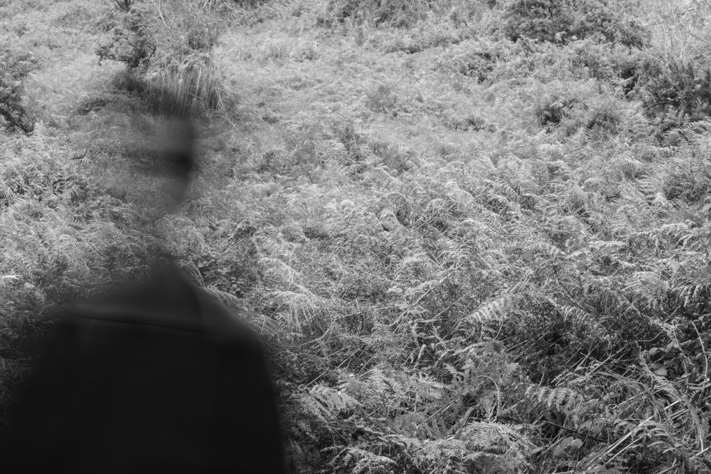
I decided to go back to the photography unit of my graphic design degree and I found two different sets of images that I thought it would be interesting to combine. One set features abstract self portraits and ruminates on the theme of mortality and transience:
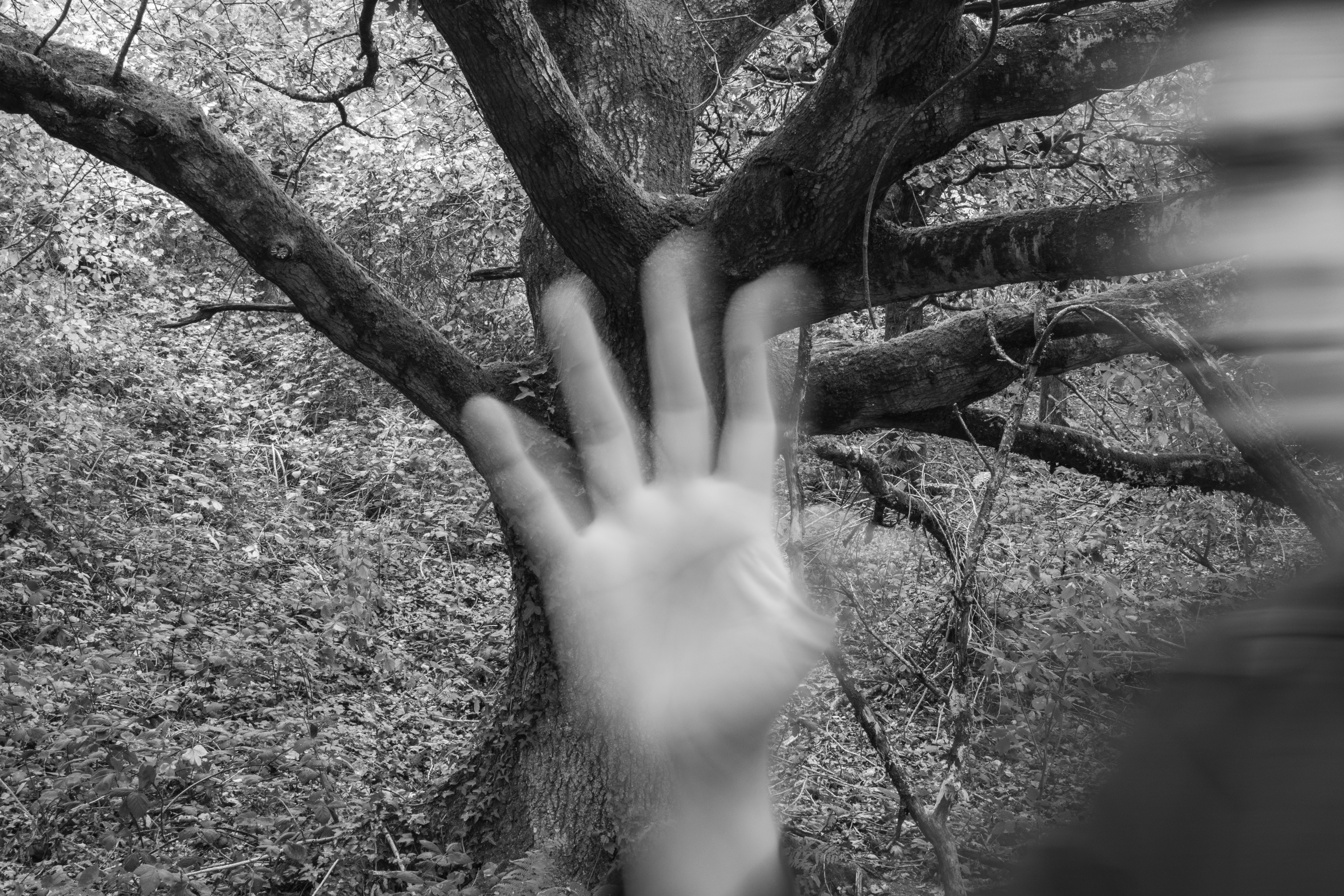
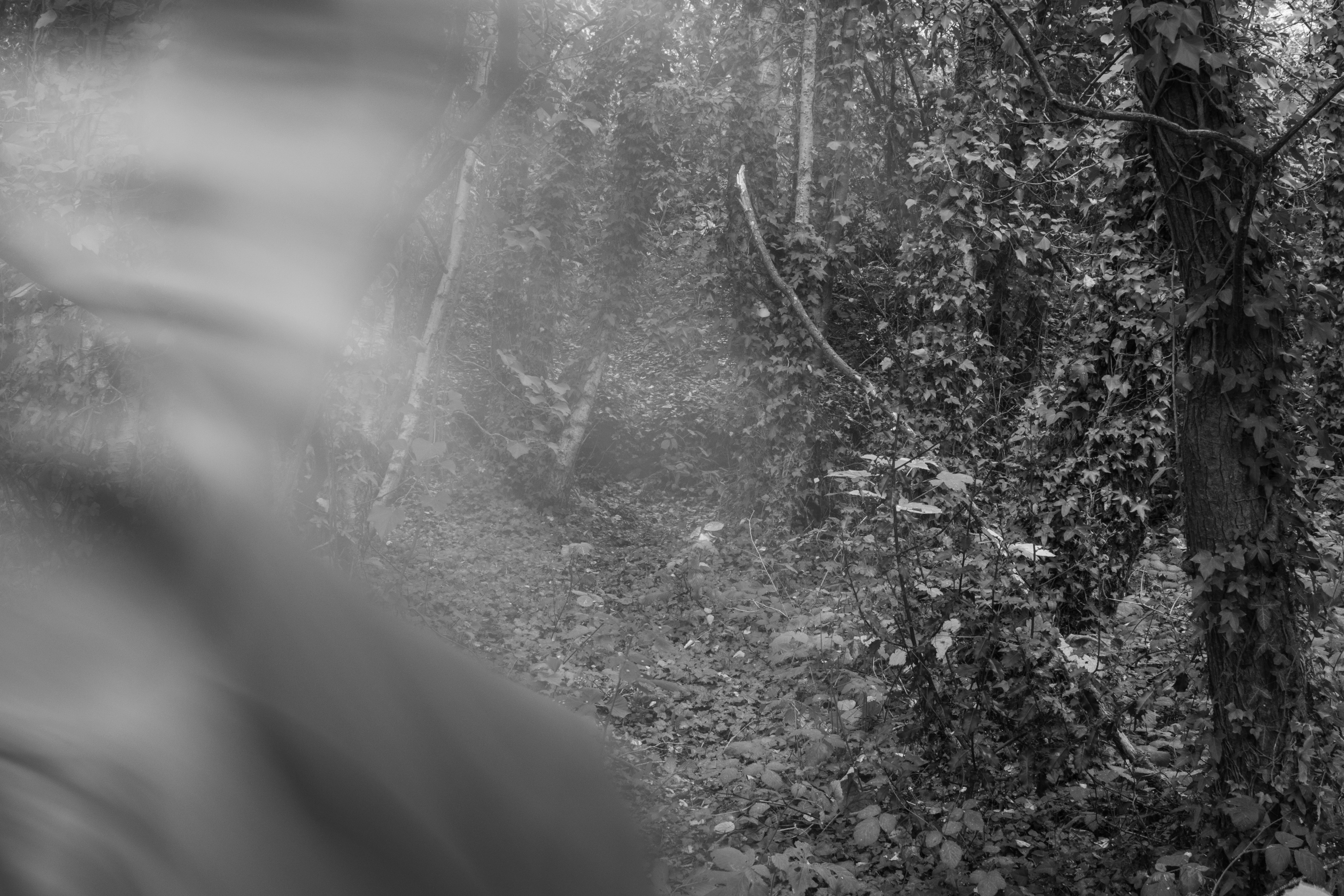
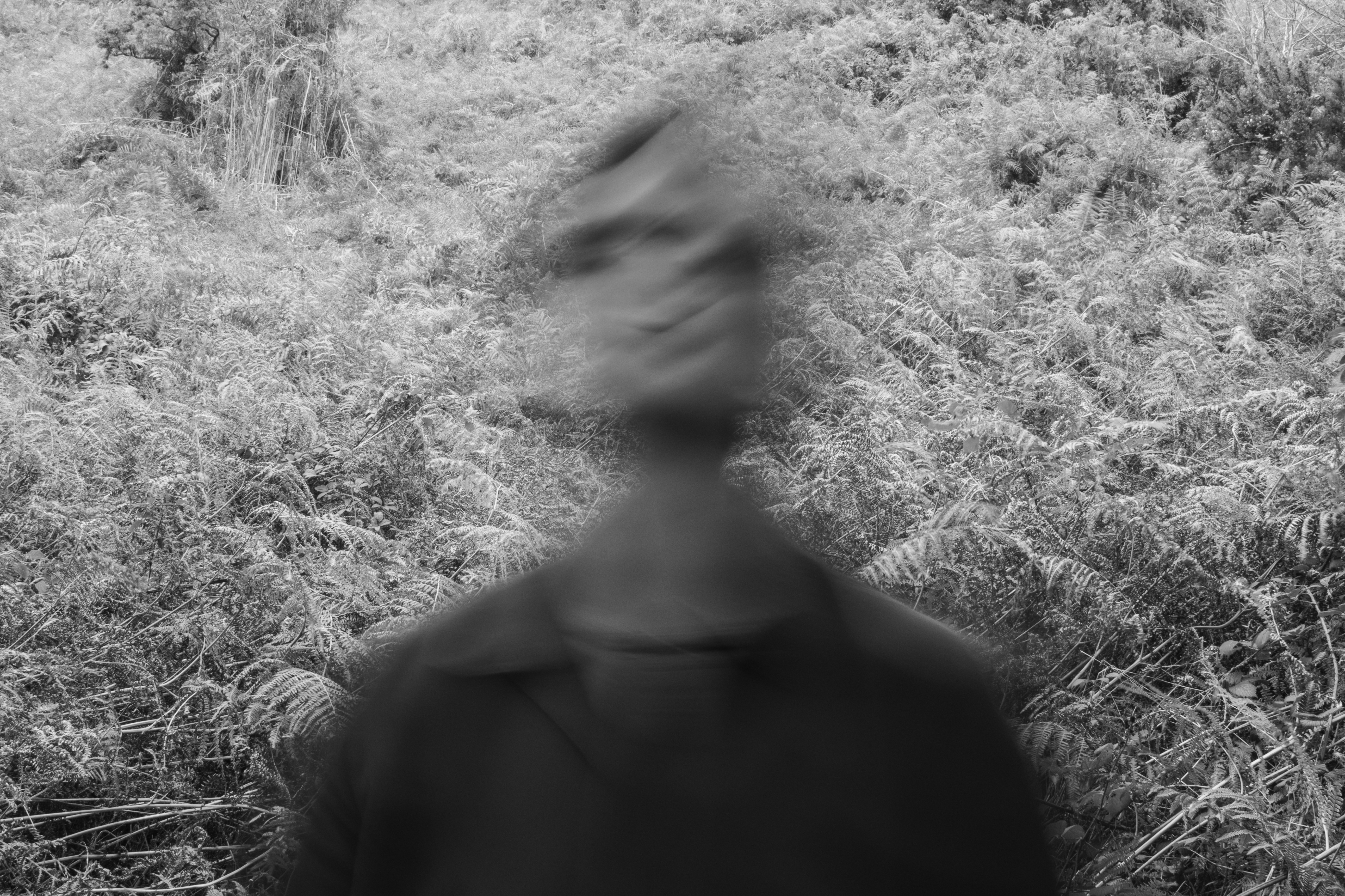

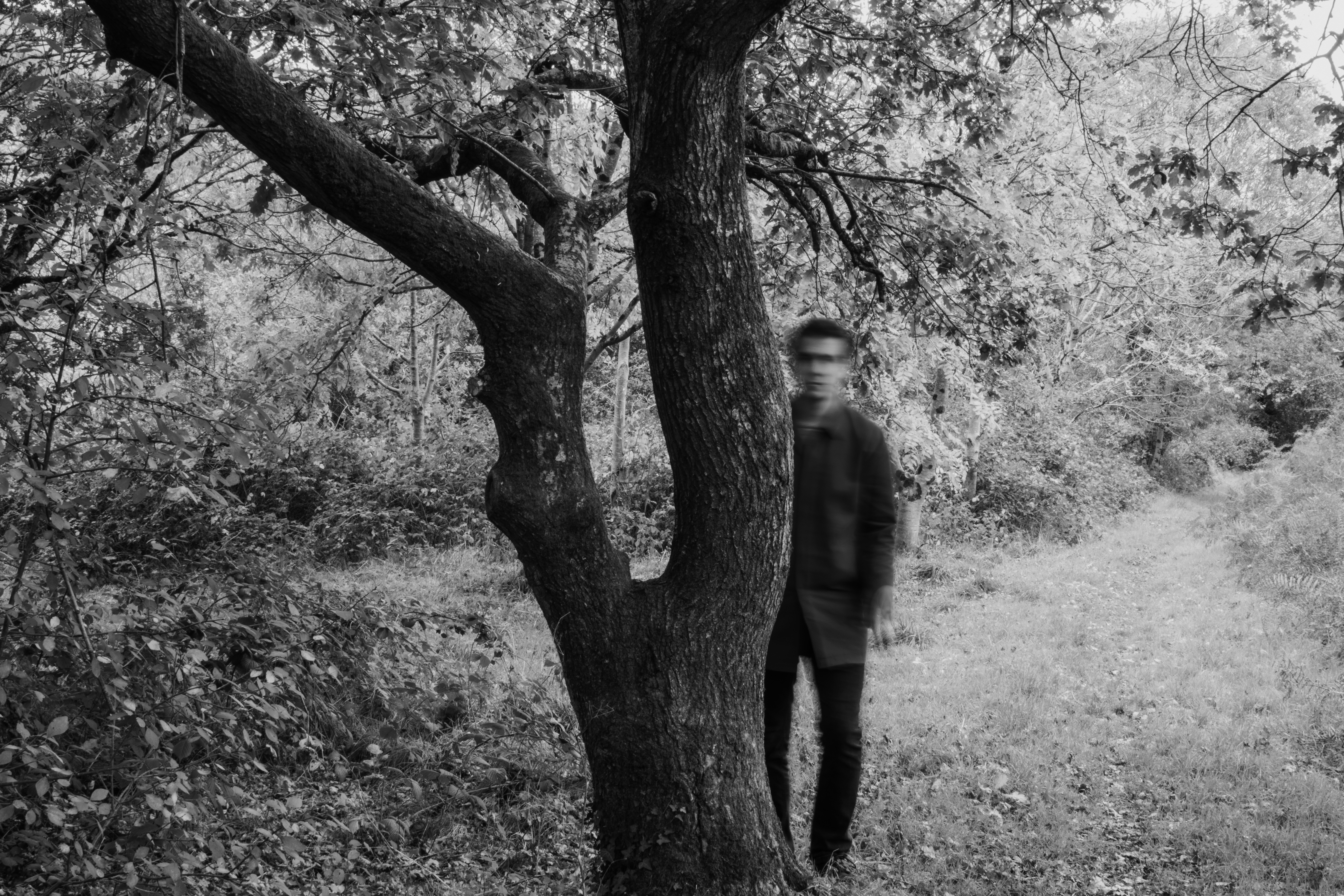
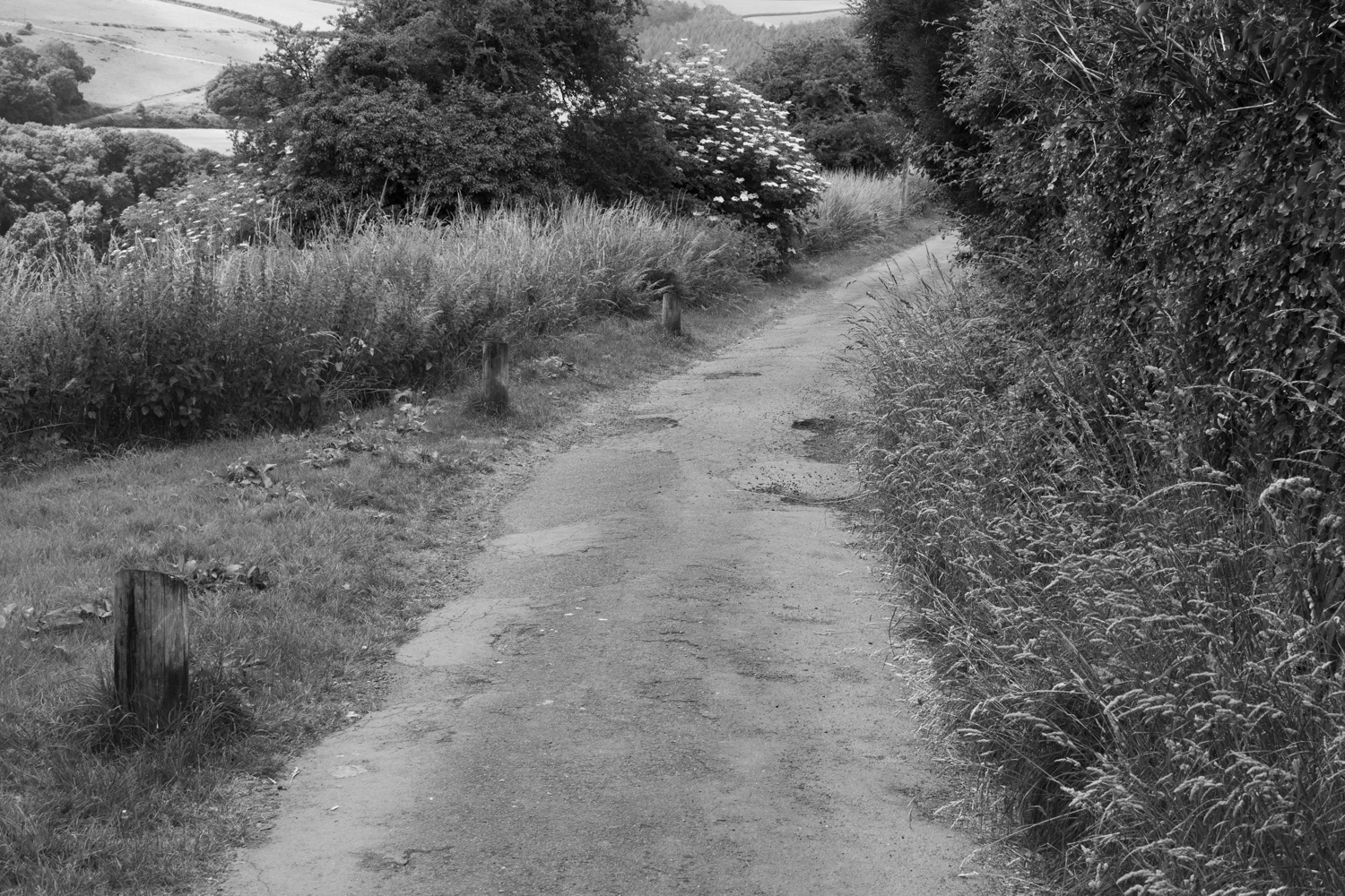
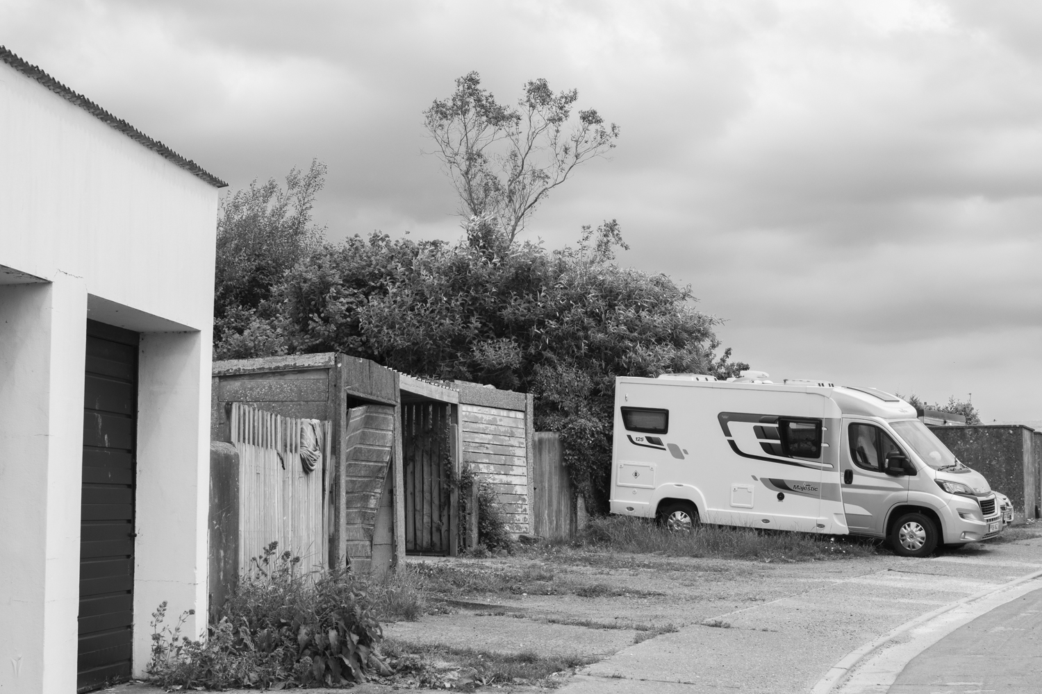
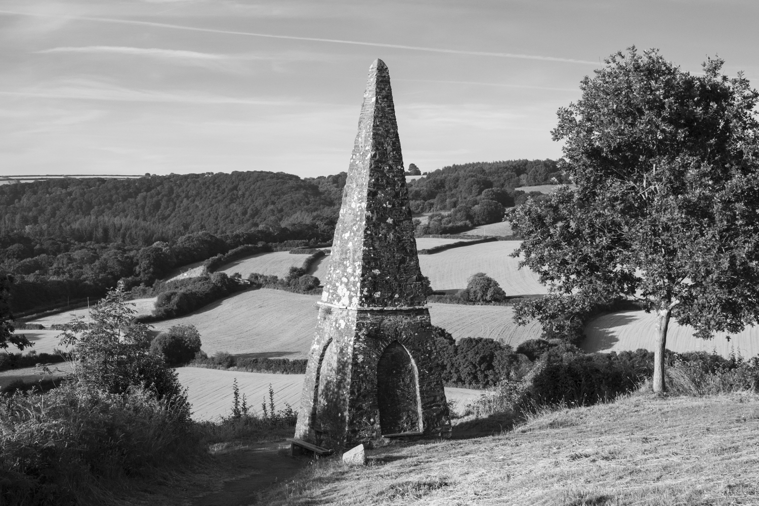
The other set explores ‘the square mile’, which is the (roughly) mile wide radius where I live. This set explores the liminality between man and nature as well as decay. I think these two sets could complement each other.
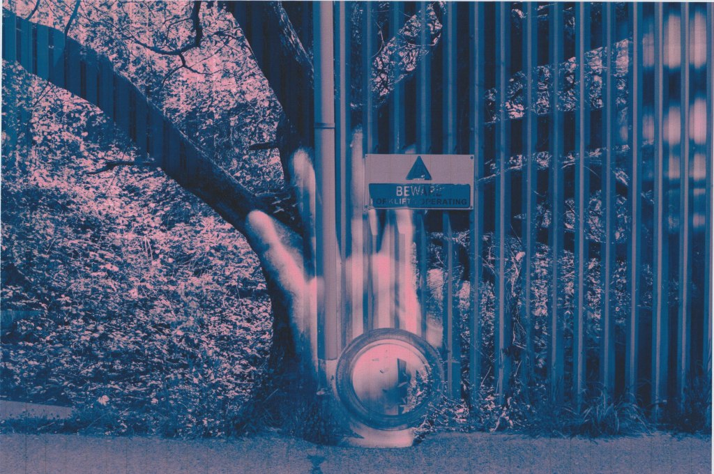
I tried some different overlaying techniques on Photoshop and created a set of images that I liked:


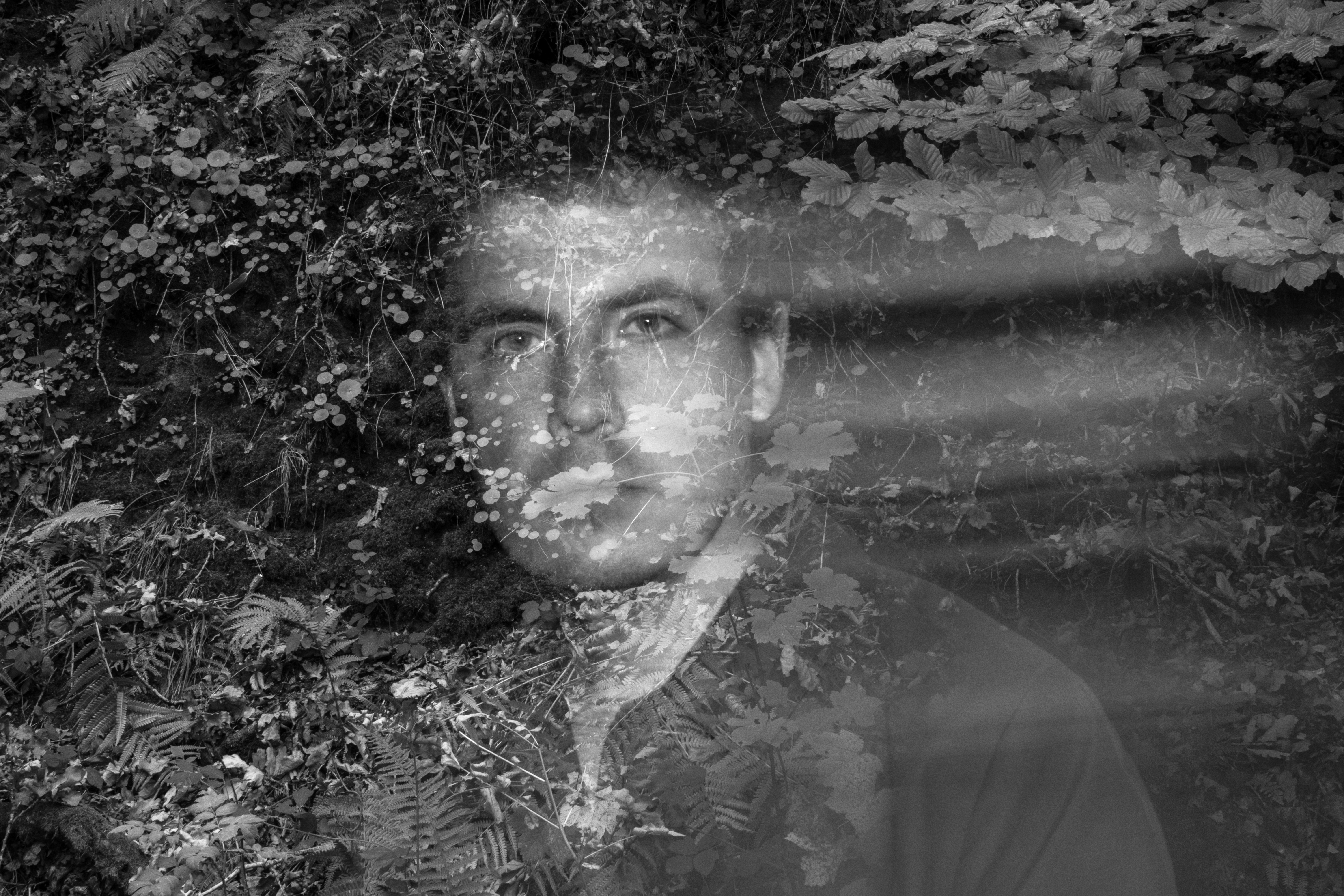
Although I think this is a captivating set of images I decided that adding colour would create more variance when printing so I edited:


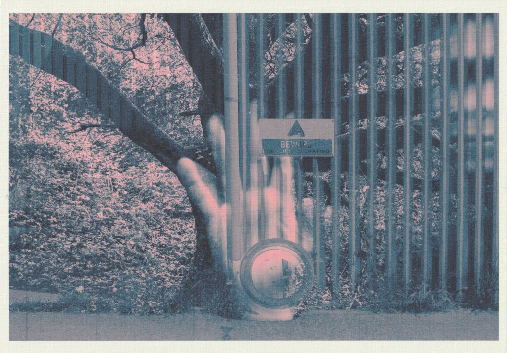
I took one of the images and printed it on various papers to note the differences:
Gloss
This is the natural choice for photographs. There is great clarity and detail with this print and strong saturation. The shadows are quite overpowering.
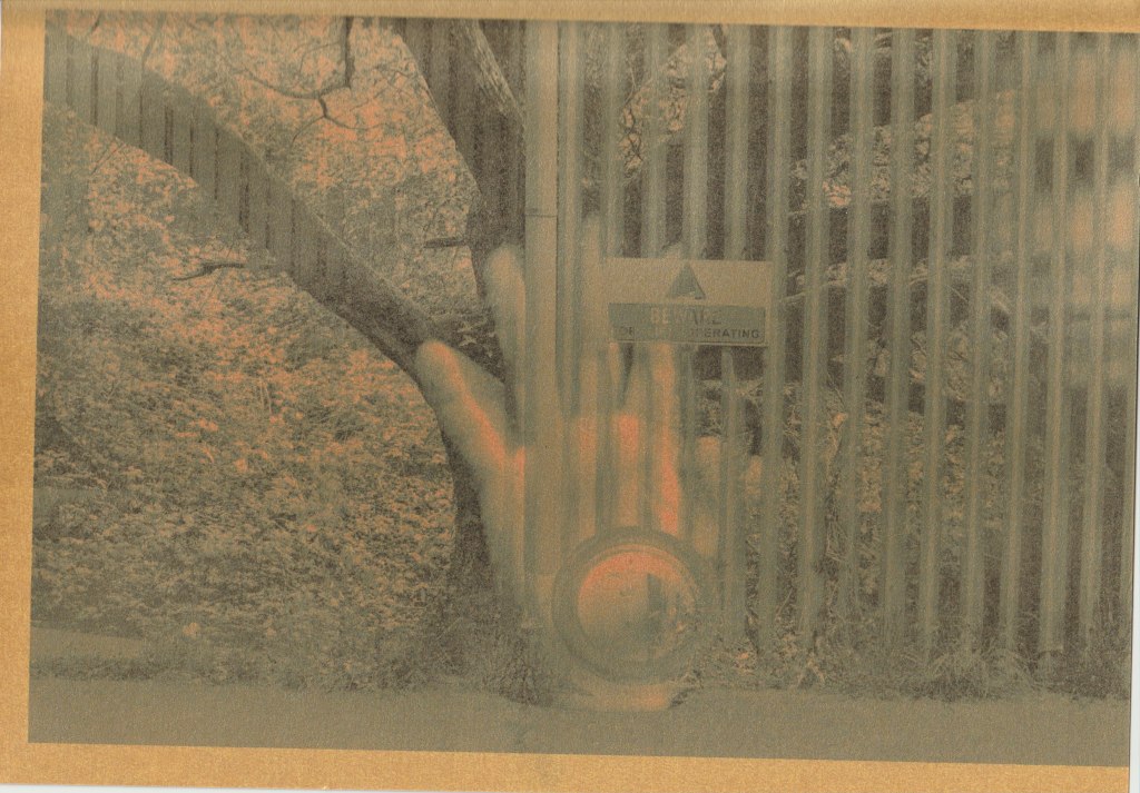
Ivory Linen
The colours are noticeably more muted in this print and detail is lost. The blues have shifted towards green. With this scan you miss the textural quality of the paper.
Kraft paper
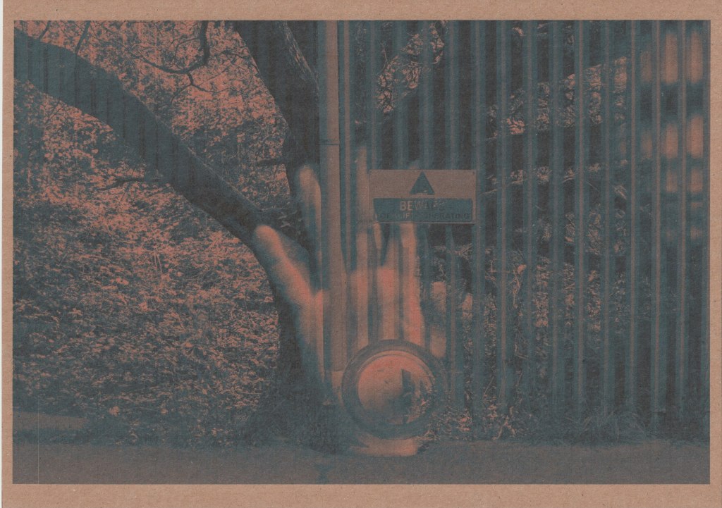
The entire print is darker and more muted. There is loss of detail and saturation.
Metallic gold
What you can’t see with this scan is the shiny and glittery quality of the paper which is quite interesting. When you move the paper at different angles towards light it completely shifts the visual appearance. I have tried to capture this with another photograph:

Red paper
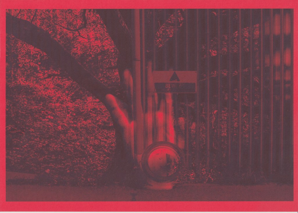
Another paper where detail and colour is lost, it could be a good choice for images dominated by reds.
Flatplan
With my selection of images in mind I then created a flatplan that details paper and image choice as well as order.

I wanted to create a photobook style and if I had binded this project (which I didn’t) I would have opted for a form of spiral binding which could allow the full pages to be viewed. My choice of papers were the glossy photo paper which is double-sided and the gold metallic paper which is single-sided. This would mean that some images would sit on the back of the metallic paper which is more or less a plain white card. The idea of having each image on two different papers was a way of further illustrating transience and decay.

When you look at the print on the metallic paper above you can see that when it is caught in light it has a haunting and faded quality to it, and it is even less discernible out of light. I think this reminds me of This Original Self by Sandra Turley which I researched here and also explores transience. I should also mention that although I planned on using black and white images for the metallic paper I wasn’t happy with it and decided to use the colour images. With the images on the back of the metallic paper I did use the black and white versions as this was another way of juxtaposing the vibrant photo paper version with a less discernible and ghostly version.
Below are my printouts and the order in which they are viewed:


The back cover is a horizontal reflection of the front cover and in hindsight I could have done this for every image in the book. A mystery stain also appeared on the print (I think moisture got on the print and caused the colours to spill) which I quite like.
Reflection
I do like the variety in this book and I love the ethereal quality of the metallic paper but it does look a bit out of place next to the white photo paper. Perhaps a white or silver metallic paper would have been less jarring. Also, the photo paper is a much smaller gsm than the metallic paper so it would be great to find a thicker photo paper or a thinner metallic paper to improve consistency. It would also be a bonus to find a double sided metallic paper. I enjoyed this exercise and I found that using different papers opened up more thematic options. I also discovered through the happy accident of a stain that it can have a very cool effect on photo paper.
