Using a found book, significantly alter the appearance of the pages to create a new volume that is personal to you. This can be any kind of book that is of interest to you. For example, a fiction book, a non-fiction book, a picture book or a photo book.
Approach the found book in a very physical way, manipulating the pages and paper inventively. If you need to, stitch or glue a number of pages together to reduce the ground you need to cover. Decide what to remove from the book, and what to add. Use the found book as a source of ideas and inspiration – the existing text may inspire illustrative, conceptual images, collages or typography as image. Embed, overlay and integrate your work into the existing pages using whatever materials, media and processes you feel necessary. This may be digital, hand-rendered, photographic, textile, or a combination of all these and more.
Think about the relationship between the content and the form, the design (text and images), the materials you use, such as papers. Perhaps you are creating a new sequence within the book?
Change the book from its original form into a different form, altering the appearance and/or meaning. Apply an inventive, intuitive response to materials and how these can be exploited within the context of the altered book.
Refer to your contextual research into artists and designers in the unit so far. Use elements of your research as inspiration and to inform your book-altering practice.
Research
For research I have looked again at some of the artists that I had previously explored in this unit that are relevant to altered books/artists books.
Tree of Codes by Jonathan Safran Foer

Tree of Codes is a book created by Jonathan Safran Foer by removing words from his favourite book, The Street of Crocodiles by Bruno Schulz. When I first came across it I was impressed by the both the boldness and simplicity of the idea. He has only used one technique in this work, that technique is paper cutting. Despite the deceptive simplicity of the undertaking he has created a radically different book with new meanings. The approach of Foer is so effective that it has inspired me to not be afraid of cutting out pieces of my own book.
A Humument by Tom Phillips

Tom Phillips’ A Humument is a found book that has been altered by painting, cut-up techniques and collage many times since 1973. He uses a greater variety of techniques and skills than can be seen in Tree of Codes, yet the result is the same, new meanings created from old works. Whereas Tree of Codes solely removes to create a new conceptual framework, A Humument also adds. I am not an artist with considerable painting skills so I won’t be using that technique in my book, however, I can see myself adding other elements such as typography or collaging for example.
This Original Self by Sandra Turley

When I first saw this work by Sandra Turley, what captivated me was how strongly it communicated fragility. It’s not just the choice of portraits that does this but also the choice of materials that she has used. Screen printing onto satin devore by using a chemical process has created transparent, ghostly images. The cover is cloth bound with tea stains which reinforces the theme of the book. What I particularly like about this work in the context of my future altered book is the willingness to use unusual materials, something I hope to try with my book as well.
A few pointers I have taken from these artists to act as a starting point for my book:
- Subtraction of material can create addition of meaning
- Adding materials or art can create a rich contextual framework
- Using unusual materials can also enliven a piece of work
My found book
The found book I am going to use is The Divine Comedy Vol. II: Purgatory by Dante.

I found this while browsing in a building society of all places. It was 50p rather than £2 and because I had £2 on me I bought another 3 books. This works out perfectly because I have some practise books as well now!
Purgatory (Purgatorio) sits between two other volumes: Inferno and Paradiso. They take Dante on a journey through the afterlife. The Purgatory volume is concerned with a penitent Christian life. I can do without the religion but the interesting part for me is the seven levels of suffering which are associated with the ‘seven deadly sins’: Pride, Envy, Wrath, Sloth, Avarice, Gluttony and Lust. Removing the religious aspect out of the picture I can already foresee a different way to explore these ‘sins’. Yes, in excess these can certainly be bad things but I should also balance my examination with a look at how in and of themselves they aren’t necessarily bad things and have an evolutionary basis that has helped civilisation form.
Mind maps

I used mind maps to explore possible imagery and ideas for the seven ‘sins’. It was important for me to find both negative associations (e.g. climate change because of human pride) and positive associations (e.g. equality through envy). It was also important to try and see as many of these associations through a neutral lens as possible. I looked at evolutionary reasons for these ‘sins’ and researched the colours associated with each.

I narrowed down my finds to some of the most powerful imagery (good, bad and neutral) and also thought about materials I could incorporate into the book. The materials included: mirrors for pride, blood for wrath, tea stains for gluttony and lipstick for lust. Some other important ideas came to me here as well. The most exciting idea was to create cellophane windows between pages to reference the transitory themes of the book and the seven levels. The desire to use different materials was directly influenced by Sandra Turley’s work that I had researched.
Thumbnails

Creating thumbnails gave me more clarity and direction. I began thinking about typographic choices, e.g. ‘Gluttony’ being spread on two pages as a visual metaphor or Pride being inflated.
Finding images for collaging
To find the kind of images I sought I had to use copyright free sources. The two main places I sourced my images from were Pexels and Bridgeman. To create cohesion I processed the images in each representative colour of each sin, e.g. pride in purple. My process to achieve this was quite simple; I opened the images in Photoshop, converted to black and white, made some minor adjustments and then added a gradient map. Pexels provided great photographs to fit my ideas, whereas Bridgeman provided interesting ephemera. I found lots of the images I was looking for but also found some other great images that fit perfectly. The most challenging aspect was representing the evolutionary aspect of the project. I wanted to incorporate ancient humans into the book but sometimes found it difficult to find images to represent each sin. Nevertheless, I feel that I found what I needed. Below is an example of the before and after for pride, as well as the rest of the finished images. These would later be cut up and inserted into my book.


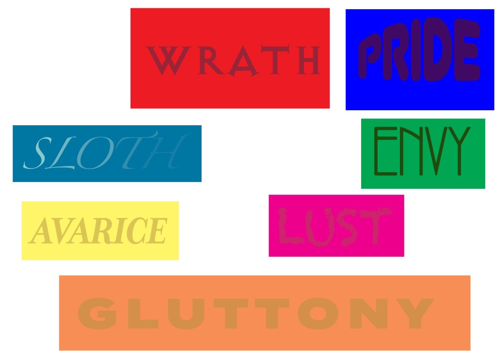
At the same time I also created typographic titles to insert into the book. These are all supposed to visually represent the sin they represent.
Testing
With one of the other books I had bought I had the perfect opportunity to test some of the material experimentation.
I bought some fake blood for the wrath pages, it works well smeared upon the page.

I wanted to use a reflective material for the pride pages to represent vanity. I didn’t have to look far to find a cheap material to use – I used aluminium cooking foil which could work well in patches.

I was initially stuck for ideas for the envy page. I became more and more drawn to the idea of the space race being a positive result of envy. So I thought about using a material that could evoke space. I found a black iridescent card which I thought was perfect for patches.

Sloth was another one I had difficulty with but I wanted to illustrate vagueness and blurriness somehow. Luckily, when I used aluminium foil I also found baking paper which gave me the idea of using tracing paper as a way of blurring words on the page.

Tea staining seemed like the perfect way to give the gluttony page its own stamp.

To create the cellophane windows I cut a shape out of two pages and then placed the cellophane inside and glued the pages shut. The results were quite good.

I tried burning pages but I think this would be more in line with Dante’s Inferno. Besides, it was too destructive and risky.

The book
The most mundane task I had was to decide which pages to remove and to proceed to remove them. I had already looked through the book and chosen some passages which I thought could fit into my vision. I also had to take into account that I needed to keep two pages in some cases to place the cellophane inside.

The finished book

On this page I have used a cellophane window over soldiers saluting the flag of the United States of America, which is an example of patriotism. There is also an image of industrialisation which illustrates human hubris and a lack of concern for the natural world. The typography I created is deliberately inflated.

On this page I have included an image that represents vanity to further the exploration of pride. I also added an image of an ancient human to tie in the evolutionary side. There are two strips of foil at the bottom to represent mirrors. I left some of my favourite text in view.

The material that covers the page here is a black iridescent card, as I mentioned previously, it is a nod to the exploration of space which could be interpreted in the early days of the space race as a positive result of envy. The green eye is a reference to the green-eyed monster. The typography I created is quite thin and sharp, somehow this seems to evoke envy for me.

The only technique here is cutting and pasting of images. The images show both positive and negative results of envy such as civil rights, war and the space race. Also, an image features of early people to tie in the evolutionary aspect. I regret that I didn’t position this better and hide more words.
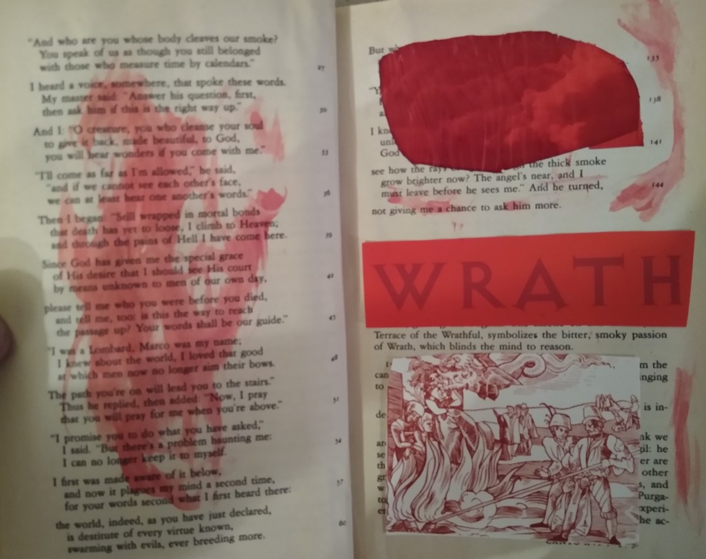
On this page I added fake blood, the perfect visual touch for wrath. In hindsight I think I could have made this look more realistic. The window looks through to dark clouds.

Protests and an angry hominid feature on this page. The fake blood looks very amateur because of the way it is spread. If I did this again I would possibly try spraying it to evenly cover the page.

The idea for sloth was to keep it minimal and obscure as much as possible to reflect the nature of the ‘sin’. The window looks through to a sleeping woman, the typography gradually fades, there is a blank page and the remaining text has been covered with tracing paper to make it vague.

The same idea on this page with an image of resting cave dwellers to show the evolutionary importance of resting.

This page for avarice is dominated by money with a grand looking typeface.

I added more images here to expand the exploration of avarice. I don’t feel like I did a good enough job removing text from view.

The idea for the gluttony typography was that it had to fit across two pages as a tongue-in-cheek representation of the section. I tried something different with the window cut out this time. The background is a cornucopia, however, I have made it 3D by adding a middle layer with two women of varying sizes.

On this page I tried the tea staining which wasn’t a success. Perhaps it is the poor quality of paper?

I had some help here to create lipstick marks. In my opinion too much text is showing which is something I will change when I rework this assignment. It doesn’t show up well here but the window looks through to a fetus.


To create the cover I used the black iridescent card because I liked it so much. I cut it to size and then attached it by sewing. To finish I spelt the book titles using glue and then positioned cellophane on top.

Reflection
In summary I’m not very happy with the results of this assignment. I think I rushed it and felt out of my depth because of my lack of ‘craft’ skills. It is perhaps the assignment I’m least happy with since I started at the OCA. I feel that it looks too amateur and hackish. There are many tweaks I could make to this as well as more general problems that need to be addressed, I will list both:
Pride – This is true of every section but I think the typography would look better if each letter was cut out and placed on the page.
Envy – The placement of images could be much better and hide more text.
Wrath – The blood could be spread more evenly, perhaps with a sprayer? Better layout is also needed.
Sloth – Better layout again. There is a problem with the tracing paper being put on glue, it soaks through. Maybe there is a better way to do this?
Avarice – The layout needs improving and I feel I need something more interesting here other than money.
Gluttony – The tea staining didn’t work very well, the problem might be that the paper is cheap so a better quality of paper might be needed.
Lust – The issues are much the same and mainly around layout.
The paper quality was poor so if I could find a copy with better quality it could mean a higher quality of work. I had a lot of issue with working my design around words I wanted to keep. Maybe I should approach it a different way, my additions could go first and I could cut and paste selections of text that I like, although this could be more time consuming. Would it fit the assignment brief if I cut out pieces of a book and pasted it into a completely different book?
One idea I was really happy with was the cellophane windows. I’d like to try more layering like I did for the gluttony page and expand this experimentation.

1 comment