Find as many examples of type as you can from a range of sources, including newspapers, magazines, flyers, leaflets, online, and printed ephemera. Broadly classify them into serif and sans-serif groups. Explore your computer to see whether you have any of the typefaces mentioned on the previous page. Find other examples on your computer that relate to these classifications. Print these off and begin to create a collection of type samples.
I gathered my type examples through various mediums such as household brands, books, CDs, film and magazines.
Serif
Sans serif
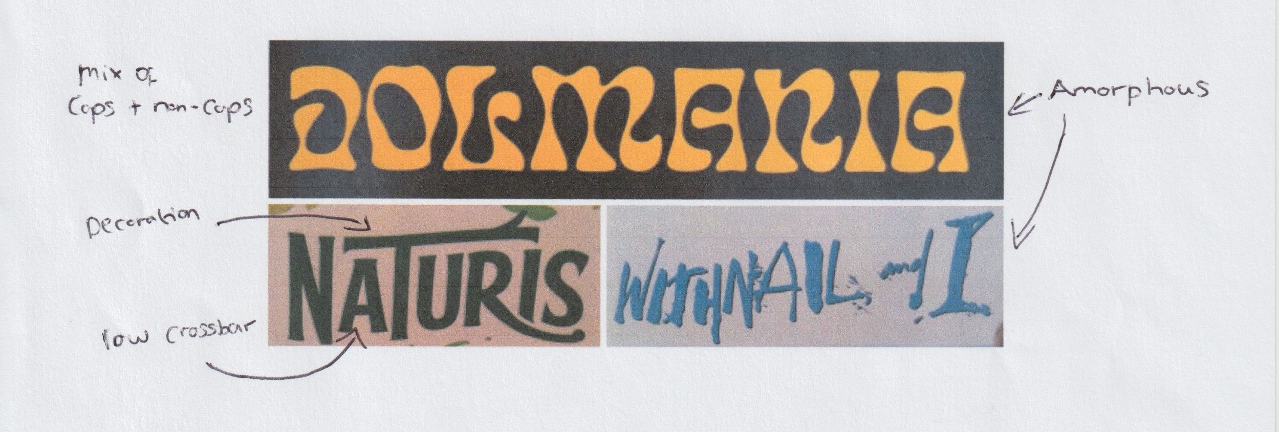
Difficult to define
A few typefaces were difficult to define. The Naturis typeface is a serif typeface I suppose but it’s incredibly subtle! The typeface used for the Withnail and I title features both serif and sans serif letters which are formed in a decorative handwritten style. The other example below is very wavy and highly decorative in nature.
For the next part of this exercise I looked on Adobe Typekit to see which typefaces I have saved in my collection.
Old Style
Modern
Slab Serif
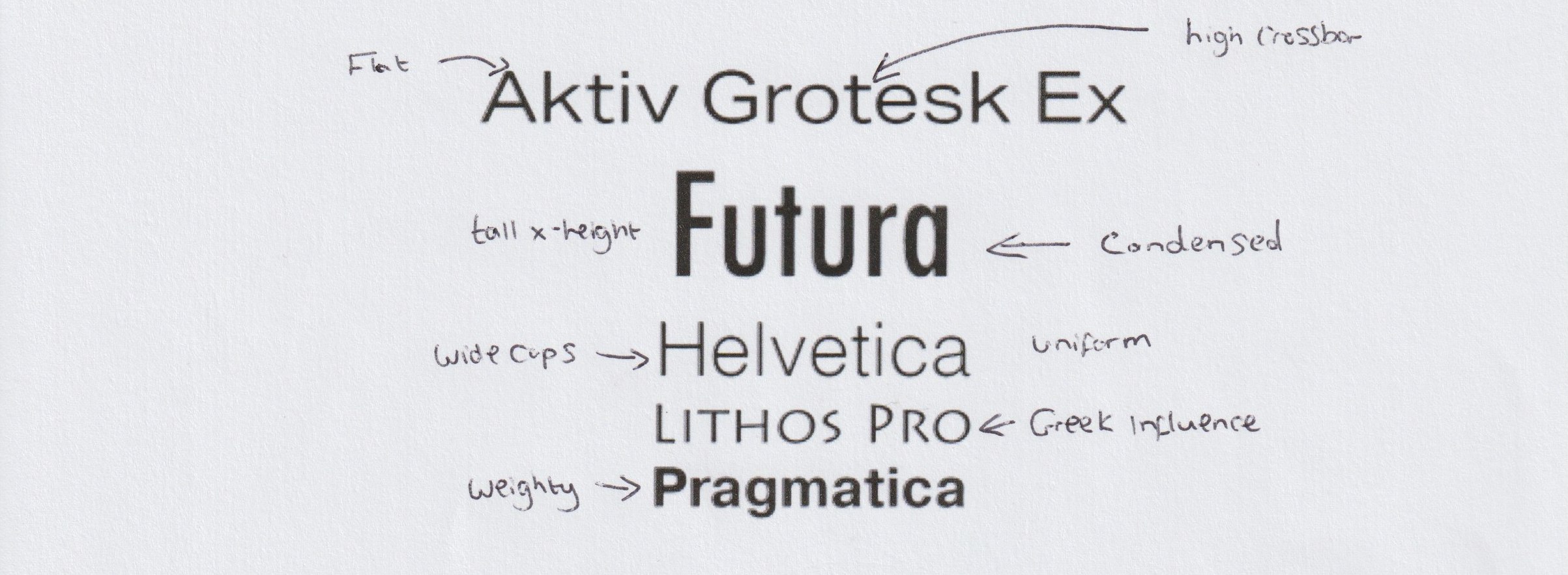
Sans-serif
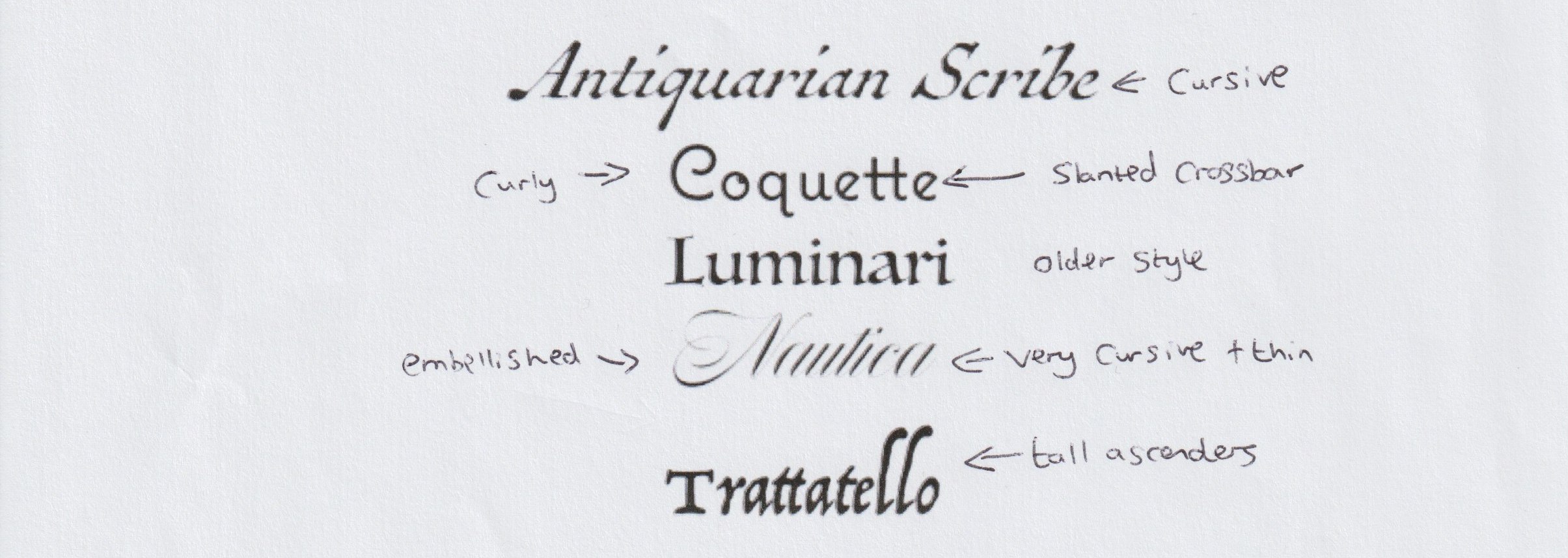
Script
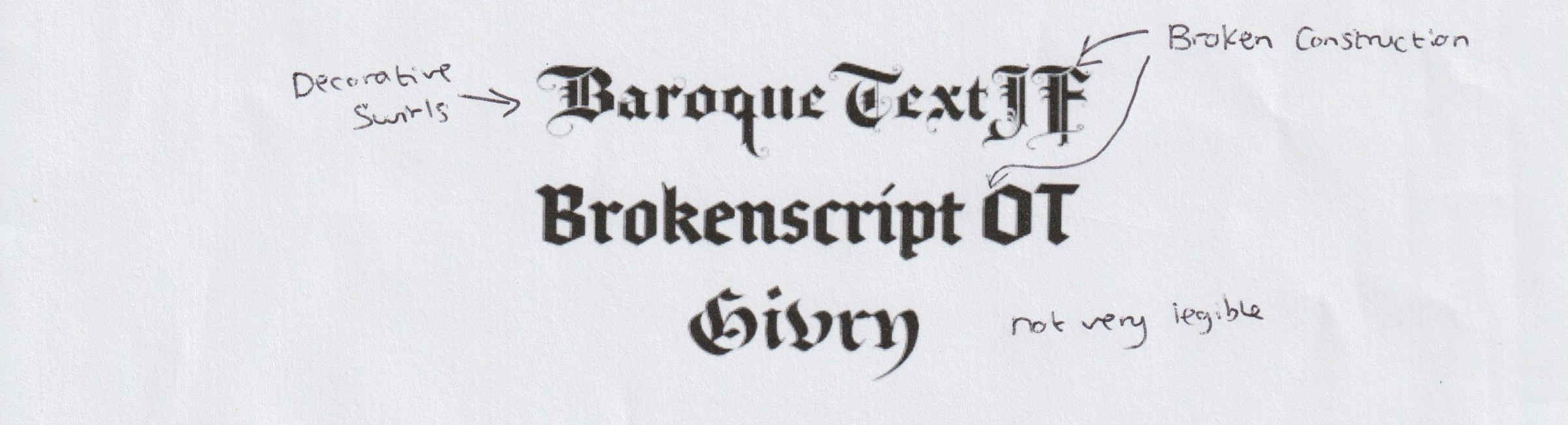
Blackletter
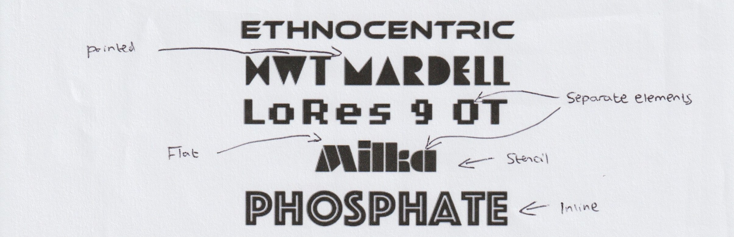
Decorative
Identify
Choose five different typefaces from your classification collection and now look for examples of how they can be used for reading in different contexts. For example, which typeface would be appropriate for a magazine, a science book or newspaper? Have you collected a typeface that might be suitable for all these subjects? As a way of testing out which typefaces might be appropriate for a particular job, also consider them as inappropriately as you can – find contexts in which they don’t work, look ugly or feel ‘wrong’ in some way. Do this by experimenting visually with your typeface choices.
For this part I used a great website called Fonts In Use to find examples of the typefaces.
![]()
Palatino is a good all rounder. It has a fairly tall x-height and average character width which both aid legibility. The weight is what I would describe as moderate and there is little contrast, these traits also enhance the legibility of Palatino. These factors mean Palatino can be used in both body text and headings with equal success which the examples below illustrate.


Futura is definitely suited more towards big bold headings. As a typeface with a heavier weight it can be a bit more difficult to read in longer passages. The heavy weight and lack of contrast make it a very bold choice for headings and titles that cut through.


![]()
Whenever I see Rockwell I think it has vintage appeal. My feelings about its uses are similar to the uses of Futura. Unlike Futura it is a slab serif typeface and I think this makes it more legible in the context of body text, however, it is still best used for display.


![]()
Coquette is a stylish script typeface. You could probably say it more idiosyncratic that the previous three typefaces and this makes it a popular choice for branding.


Nautica turns the idiosyncratic and bespoke dial up a few notches. It is another script typeface but with a much thinner weight and an elegant appearance to it. Even as heading text it lacks readability so it is only used when absolutely called for.


After looking at the these typefaces I want to try them in different contexts and see how they each fit in.
Magazines spreads
I took this template from InDesign and added my own photograph.

Palatino works very well in a magazine. As a serif typeface with a moderate amount of contrast it is very readable in large blocks for body text. It also works well in bold as a heading. This would similarly work well in books.
Verdict: Works

As a big and blocky sans serif typeface, Futura is strong and makes a great heading. As body text it loses its readability and isn’t a great choice.
Verdict: Works better as heading text

Rockwell has a thick and blocky quality but it is has serifs and slight contrast. This places it somewhere in between Palatino and Futura. It wouldn’t be as suitable as Futura for headings or Palatino for body text.
Verdict: Works but there are better choices

Coquette is a highly stylised script typeface and you wouldn’t usually find it in this kind of setting. It creates and uncomfortable reading experience.
Verdict: Doesn’t work

This lacks readability and legibility even more so than Coquette. A definite no.
Verdict: Doesn’t work
Business Cards
This was another template I used from InDesign.

Palatino would provide a great typeface for a business card if you wanted a more traditional aesthetic.
Verdict: Works

Futura provides a strong impact for a business card looking for a more modern feel.
Verdict: Works

Rockwell also works well as a business card typeface.
Verdict: Works

Coquette provides a more personal touch and with no large bodies of text the readability is not an issue.
Verdict: Works

Although the tracking is increased here, Nautica doesn’t provide the instant impact a business card needs.
Verdict: Could work for the right design
Magazine cover
I took this template from InDesign and added my own photograph.

For such a contemporary layout, Palatino works quite well here. It loses some of its appeal in the larger heading text however. It would be a great addition to more traditional magazine covers.
Verdict: Works

This is the perfect setting for a typeface such as Futura.
Verdict: Works

My thoughts on this are the same as Palatino.
Verdict: Works

Unsurprisingly, Coquette loses readability and impact in larger blocks of text.
Verdict: Could work for the headings but not the body text

Nautica is extremely messy in this setting.
Verdict: Doesn’t work
Posters
I used a minimalist poster design I had created for Graphic Design 1 for these examples.

I see no issue with Palatino being used for the right kind of poster. In this particular design it doesn’t synchronise with the image because of the contrast and serifs.
Verdict: Not great for this design but can work well in other posters

Futura works well here because of its lack of contrast and serifs.
Verdict: Works

This works quite well but Futura is still a better choice.
Verdict: Works

Although I think Futura is a better choice, Coquette does work because of its lack of serifs and the musical quality of the curves. It could easily work in many posters.
Verdict: Works

It doesn’t work here but I could imagine it being used in more experimental settings for posters.
Verdict: Doesn’t work here but it could work well in other posters
Book covers
I used a book design I have worked on for these examples.

Definitely a good typeface for the right book design. In this case it works better for the understated author name rather than the title.
Verdict: Can work well for the right designs.

Futura certainly complements the modern, minimal design here.
Verdict: Works well

Rockwell works nicely here. Modern enough to gel with the illustration and traditional enough to evoke the story.
Verdict: Works well

Not a great choice for this design but Coquette works well on book covers.
Verdict: Doesn’t work here but can in other designs

A bad choice here but I also see Nautica as a typeface that could be used in book design.
Verdict: Doesn’t work here but can in other designs
Logo design
This was another design of mine from Graphic Design 1.
Palatino is better for use in body text rather than branding, especially modern branding such as this.
Verdict: Not its strong point
Futura provides strong branding. For this particular design I would want something with more of a touch of sophistication though.
Verdict: Works but lacks character
A good typeface for logos and branding. It works quite well in this setting.
Verdict: Works
Coquette is absolutely a typeface that can be used in branding and logos. It is probably the best choice for this design. Blocky enough to complement the image but also embellished enough to add refinement.
Verdict: Works
Not the right choice for this design but a very strong typeface for the right logo and branding.
Verdict: Not ideal for this design but a good branding typeface
Develop
Trace some interesting, unusual and everyday letterforms onto clean paper. This will help you to understand the distribution of weight of line within a particular letterform. Draw over the tracing to enchance the line and fill in the letterform with an even dark grey tone – HB pencil is fine – to recreate the impression of print.
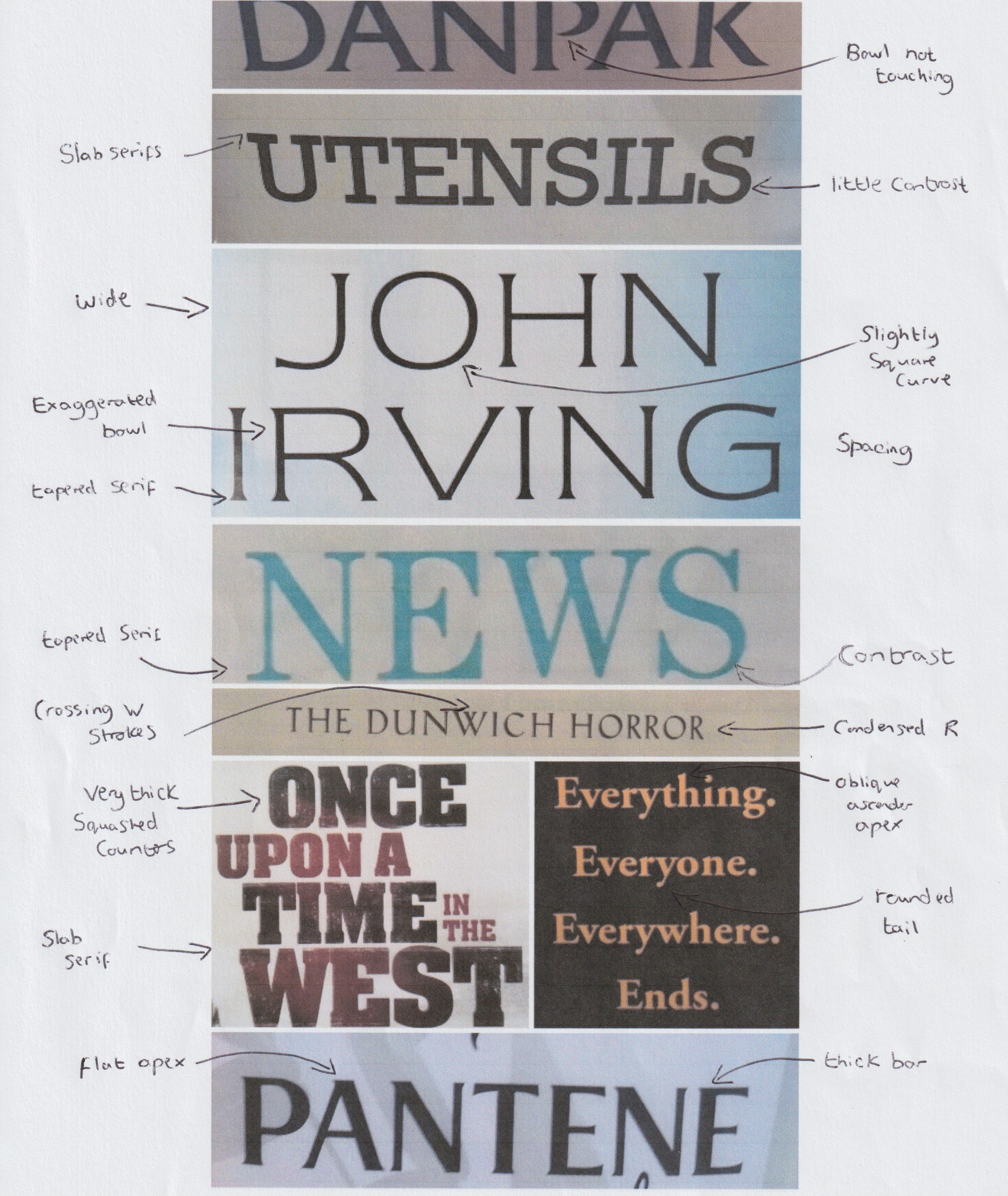
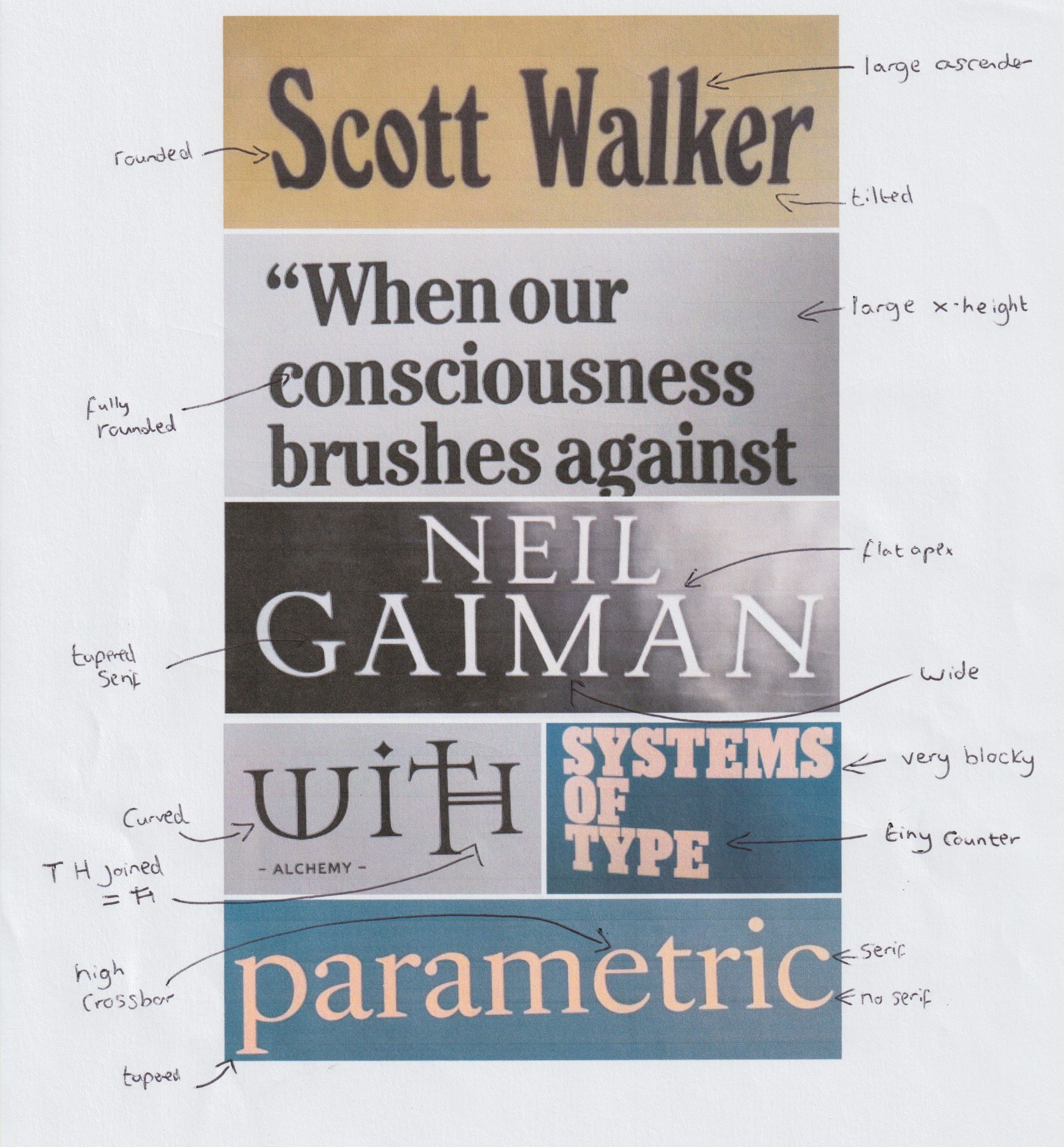
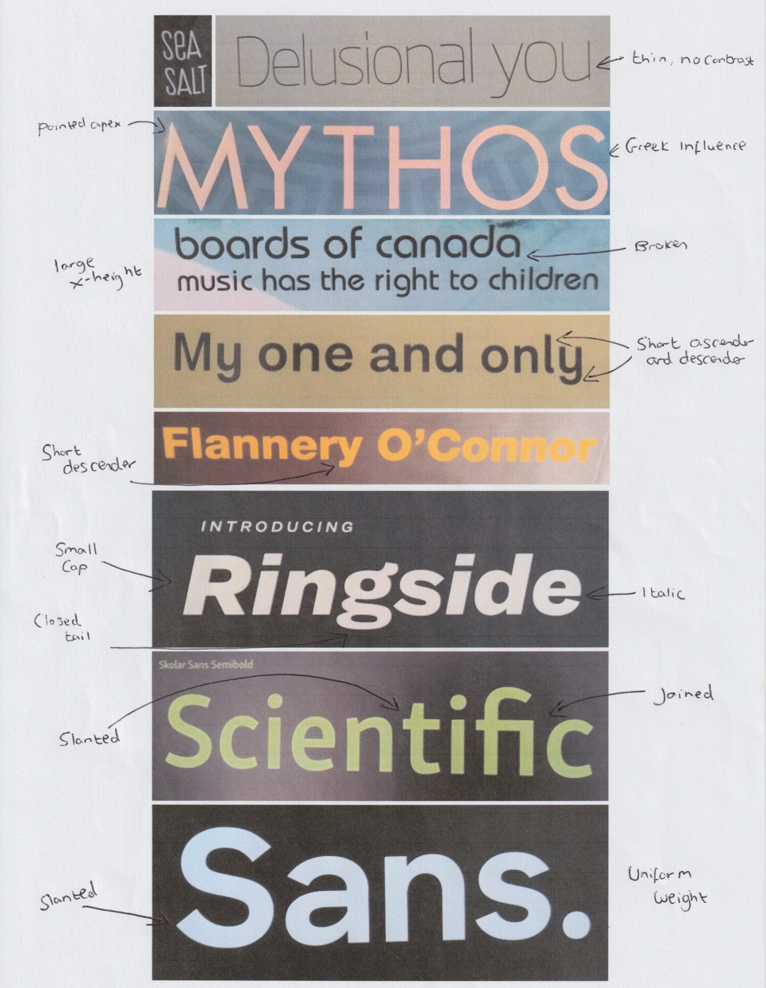
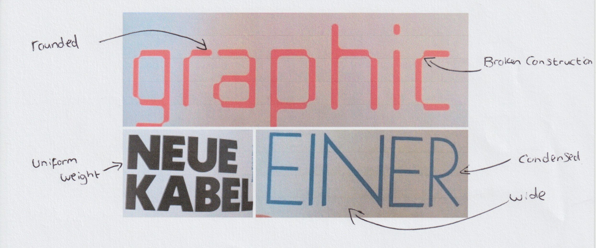
Using books and magazines I have traced a diverse selection of letterforms.

Paying attention to only weight and contrast still reveals a lot of variation with these examples. Even with the varying sizes it is still quite obvious which letters/words are weighty and which are not. A few examples seen in the words ‘one’ and ‘HIER’ reveal an incredibly thin weight where I didn’t even have to shade it in after tracing it. These thin letterforms create sparse words where the space around the letters becomes just as important.
The ‘J’ in the middle is a very unusual form of the letter. Aside from this my observation is that it is more of a medium weight with some contrast, it creates an elegant visual. The ‘E’ next to it and the ‘K’ and ‘g’ to the upper right are weightier and have more extreme contrast. The ‘g’ has a meandering river like quality because of the contrast in weight and curvy lines. The ‘K’ is particularly interesting to look at in detail because the stem and leg both have a much thicker weight than the arm. Other letterforms such as the ‘T’ on the left side and the ‘e’ on the right side have little to no contrast and a very thick weight.
Reflection
This has been a laborious exercise but one that has been worthwhile. Collecting and analysing typefaces has revealed many different characteristics that would often be missed. Using different typefaces in different contexts was fun and it is sometimes necessary to see why something doesn’t work visually rather than following the theory of why it shouldn’t. I suppose seeing typefaces that looked jarring in the ‘wrong’ setting has made me ponder how there isn’t really a right and wrong and how a juxtaposition of text and layout can sometimes be the desired effect. Tracing letterforms was also very interesting because it felt like I was taking a magnifying glass to the typeface design and examining the smallest details.
